Compre Ahora
Helping small retailers across Argentina restock their stores from a phone, in whichever language they're most comfortable in.
 01
01
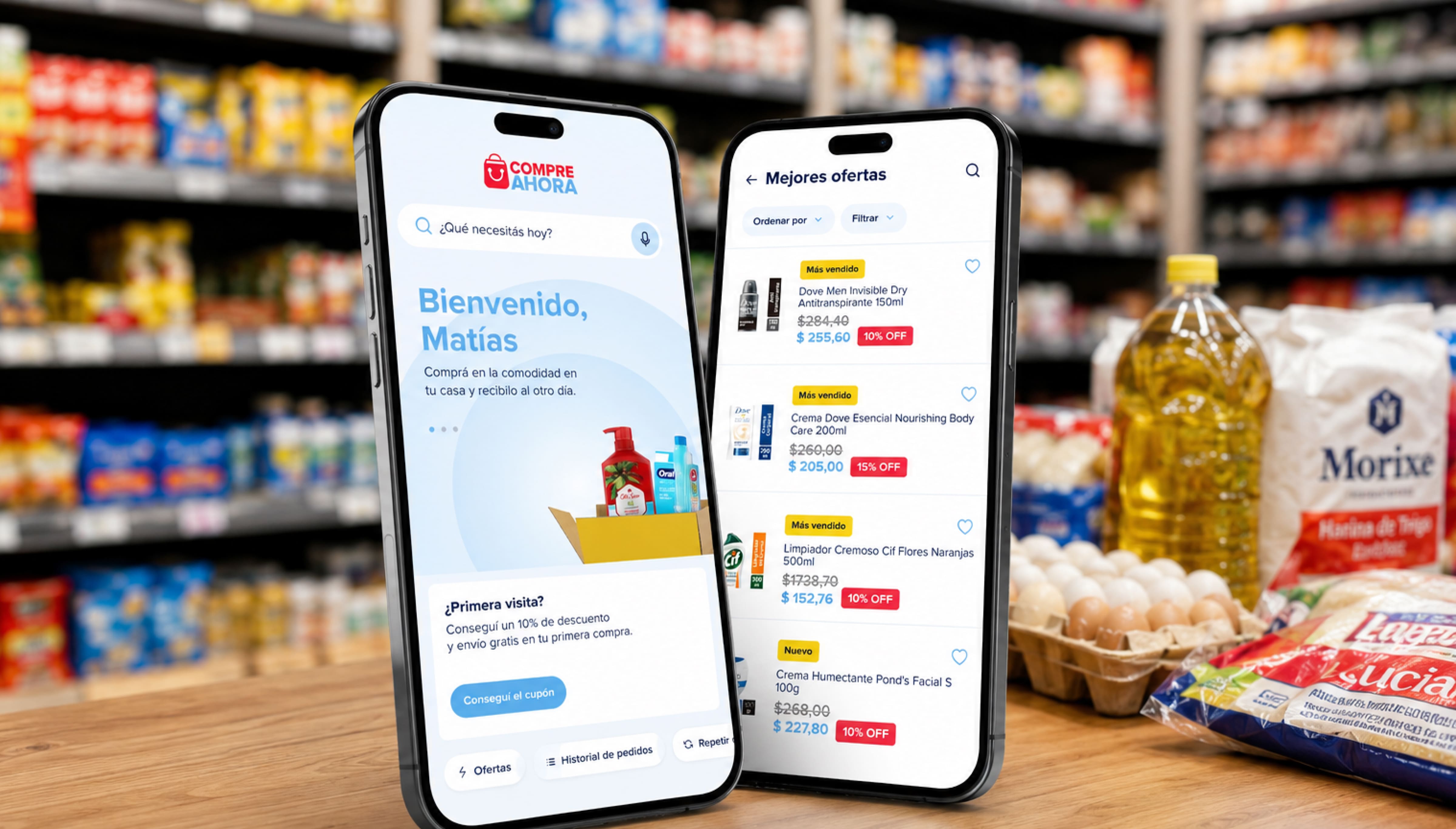
A B2B wholesale marketplace connecting small retailers across Argentina with major consumer brands like Unilever and Kimberly-Clark.
A wholesale warehouse that fits in a shop owner's pocket.
Compre Ahora is a B2B wholesale marketplace in Argentina where small retailers (kiosks, corner stores and small supermarkets) restock directly from brands with no middleman, ordering from a phone 24/7 with free shipping nationwide. While I was working on it, the platform connected more than 50,000 registered retailers with wholesale suppliers across the country, moving millions of products every month.
My part in that wasn't one single feature. It was a long list of smaller, meaningful improvements across the web and the app: the kind of work that doesn't show up as one dramatic redesign, but adds up to a lot fewer reasons for a busy shop owner to give up halfway through an order.
Compre Ahora was already live, with retailers placing orders every day. Nothing could break mid-order, so every change had to ship into a product that never stopped running. That constraint shaped almost every decision.
My role
Worked from Accenture in Colombia, directly with Compre Ahora's team in Argentina, at a time when the platform was part of Unilever.
Worked on many parts of the experience over time, across both the website and the mobile app.
Focused most of my attention on the app, since that's where most retailers placed their orders.
Worked closely with Compre Ahora's own product team, testing some changes directly with real retailers.
Spanish first, but never Spanish only.
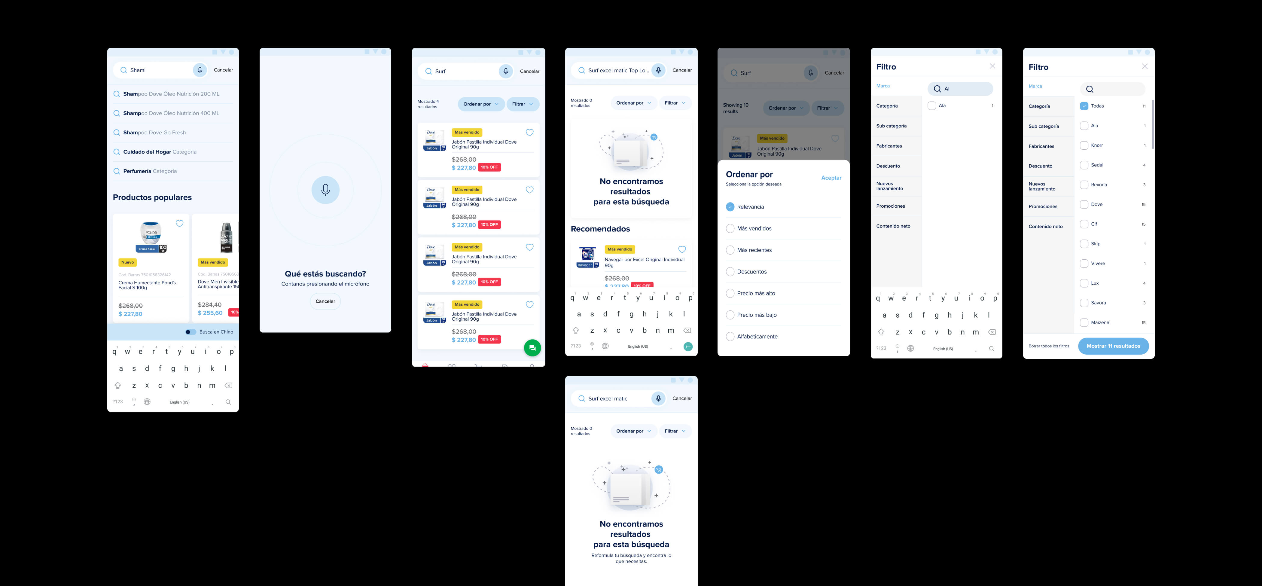
Most of Compre Ahora's retailers shop in Spanish, but a meaningful share of them, including many Chinese-speaking store owners, are more comfortable reading in Chinese. I designed the language-switching experience for the website and the app so a retailer could browse, order and pay in whichever language they understand best. English is on the roadmap for a smaller audience, but Chinese came first because it was the language many active store owners needed most.
What mattered most was making sure the language switch held all the way through checkout and payment, so a retailer never had to fall back into a second language partway through an order.
Before a retailer can buy anything, someone has to say yes.
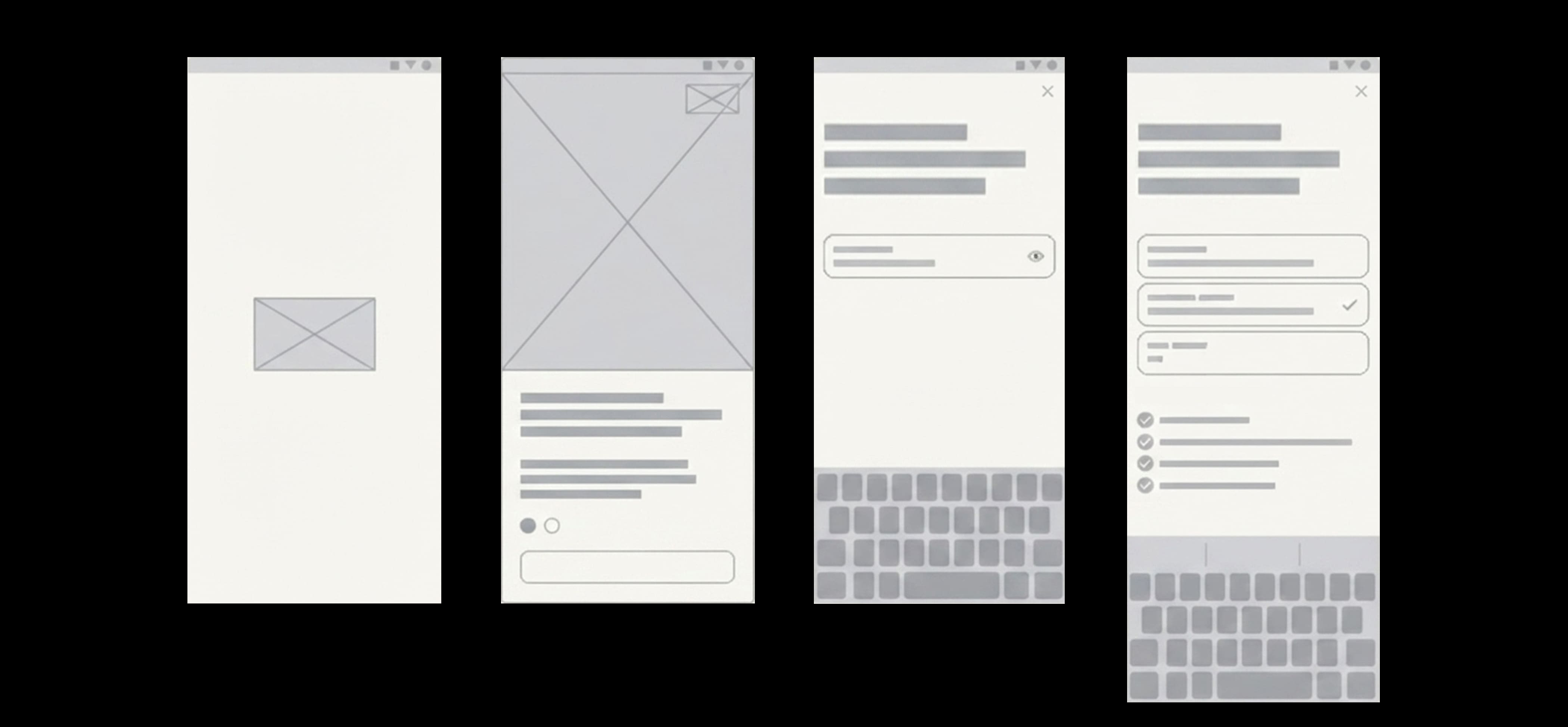
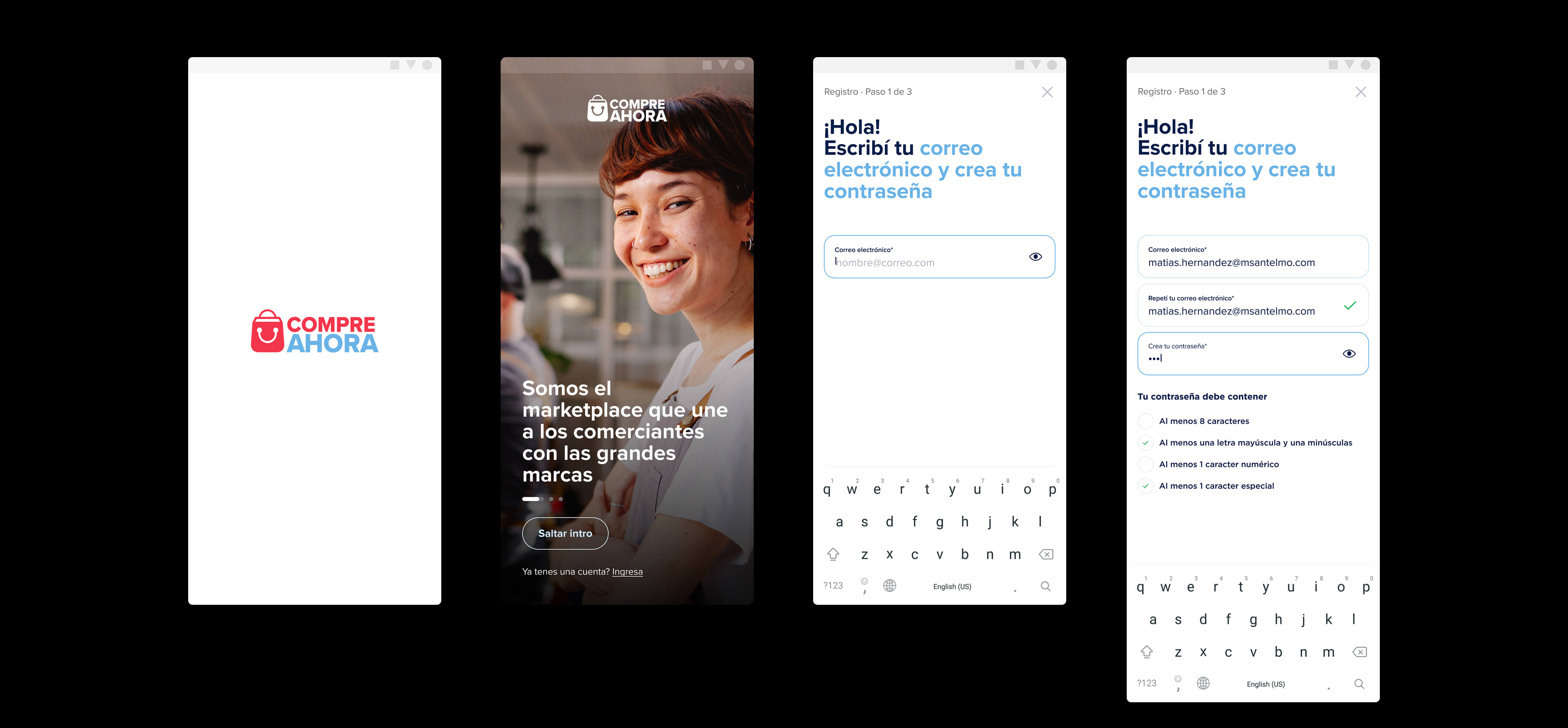
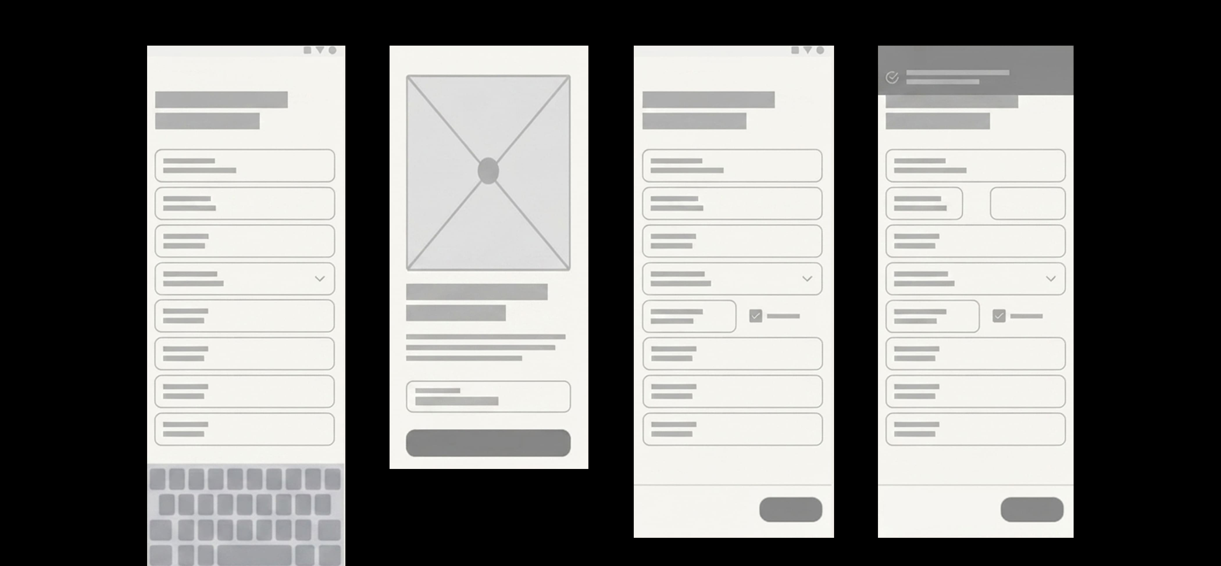
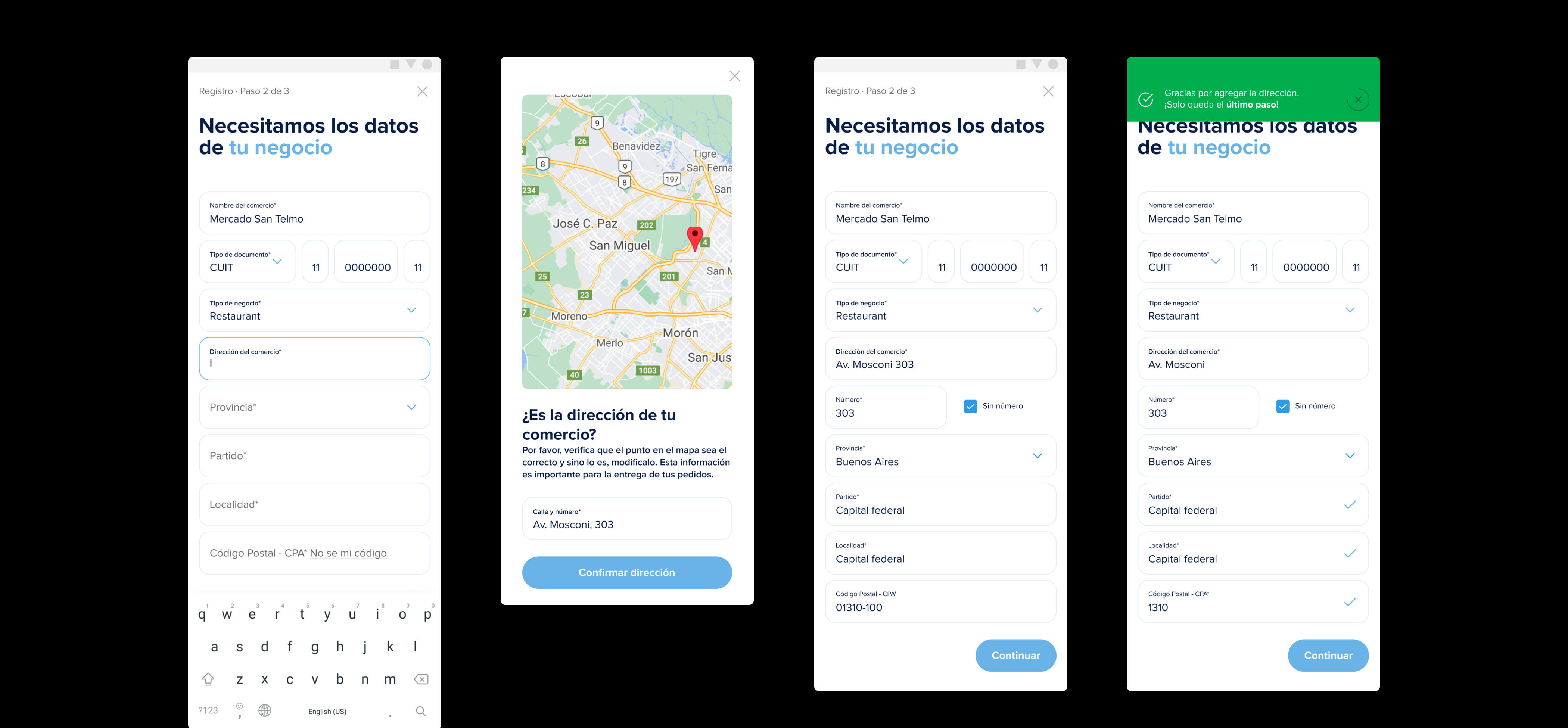
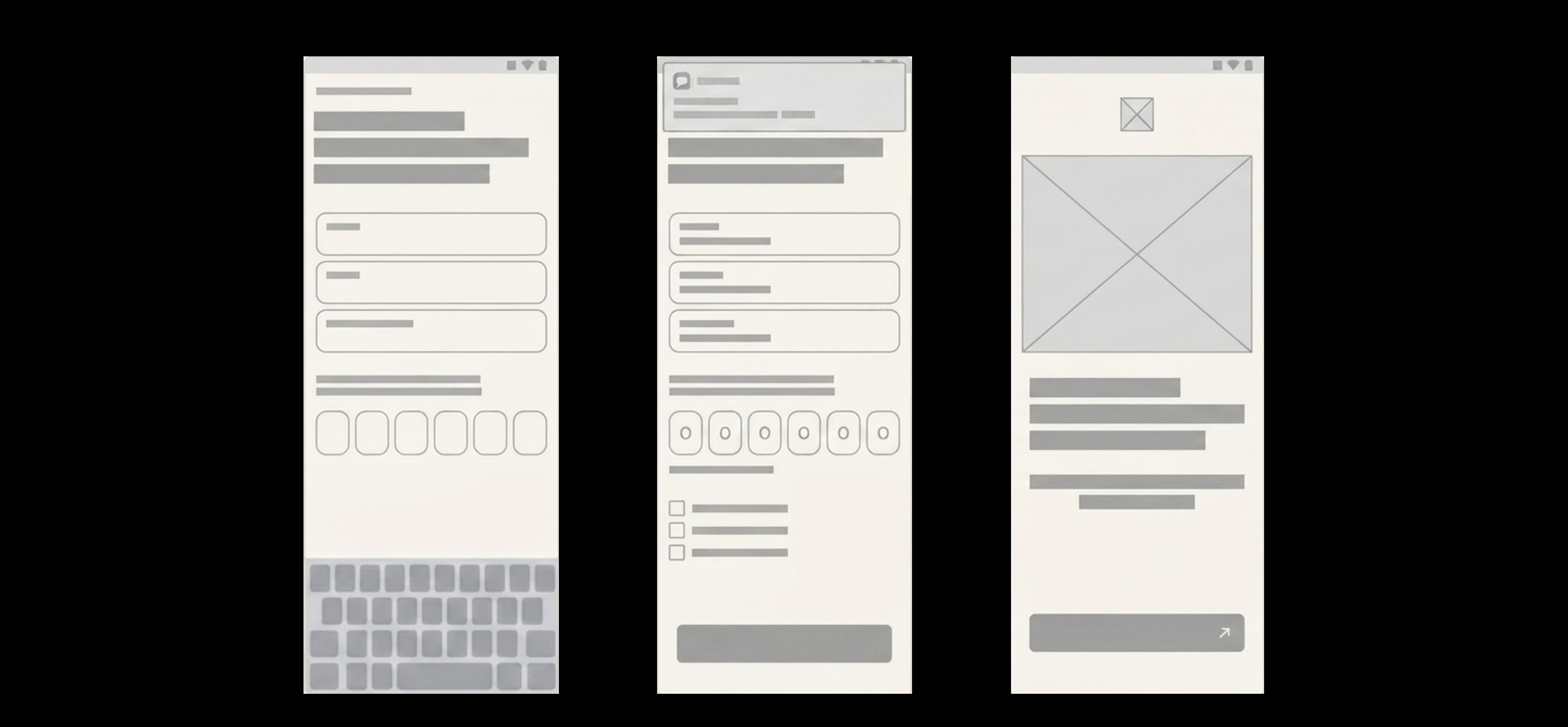
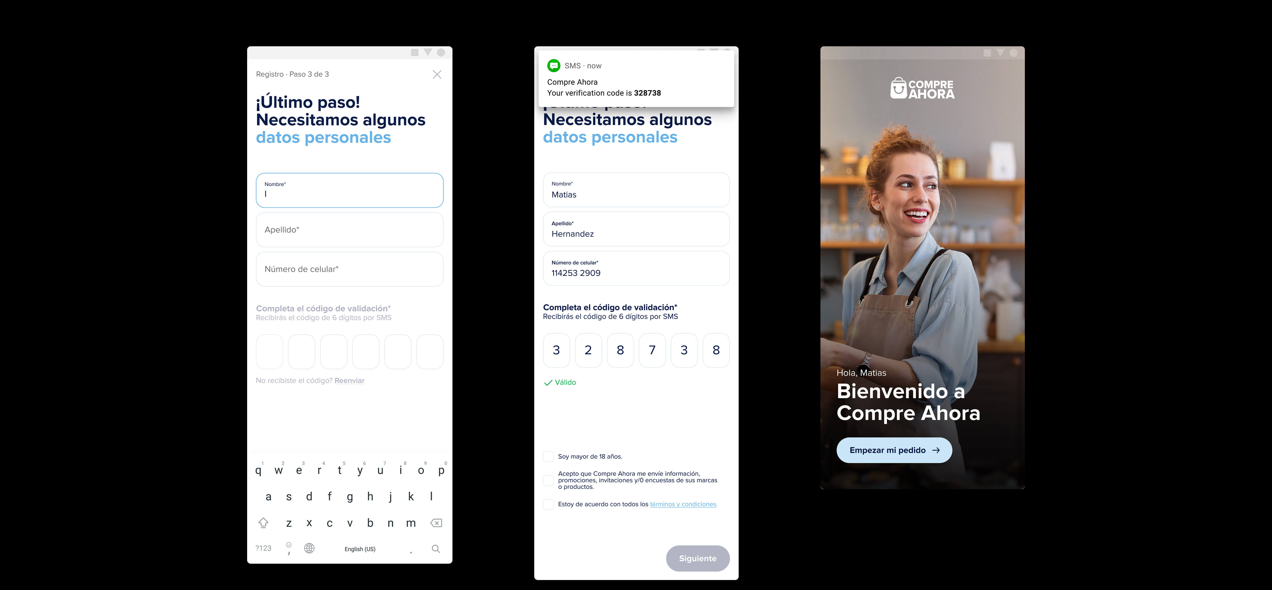
Every new business on Compre Ahora has to be validated and approved by the official distributor in its region before it can place an order, so registration isn't just a form, it's the first real interaction a new retailer has with the platform. I worked on the three-step flow retailers go through to get set up, along with the error and success messaging that keeps them oriented if something goes wrong along the way.
-
1
Registration
The first step into the platform.
-
2
Business details
What the distributor needs to validate the store.
-
3
Personal details
Contact details for the account owner.
 04
04
 05
05
 06
06
 07
07
 08
08
 09
09
Helping a shop owner decide fast, and decide right.
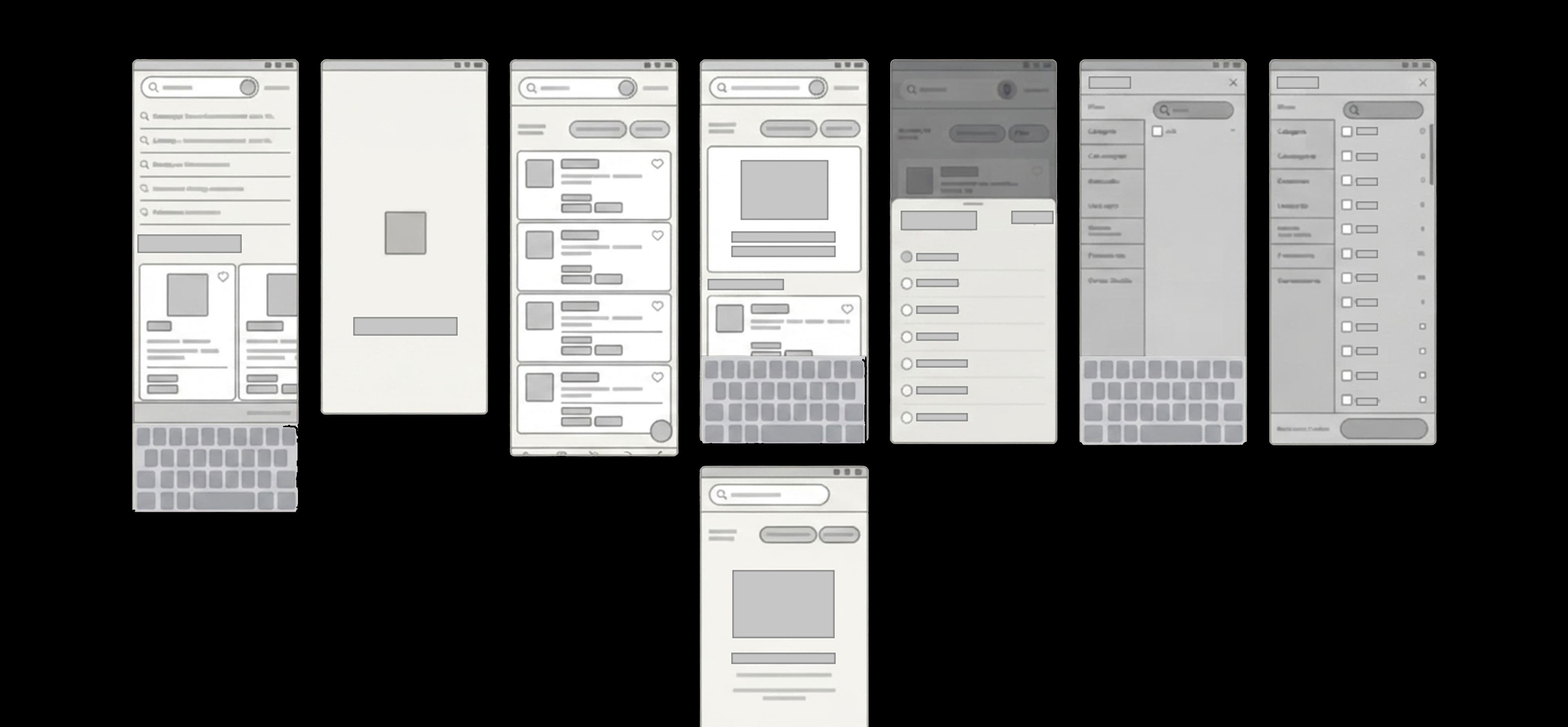
Retailers on Compre Ahora aren't browsing for fun. They're buying in bulk, often between customers, on a deadline. Three parts of the experience were really about the same problem: what to feature, what to explain, and how to find it.
01 Best offers & top sellers
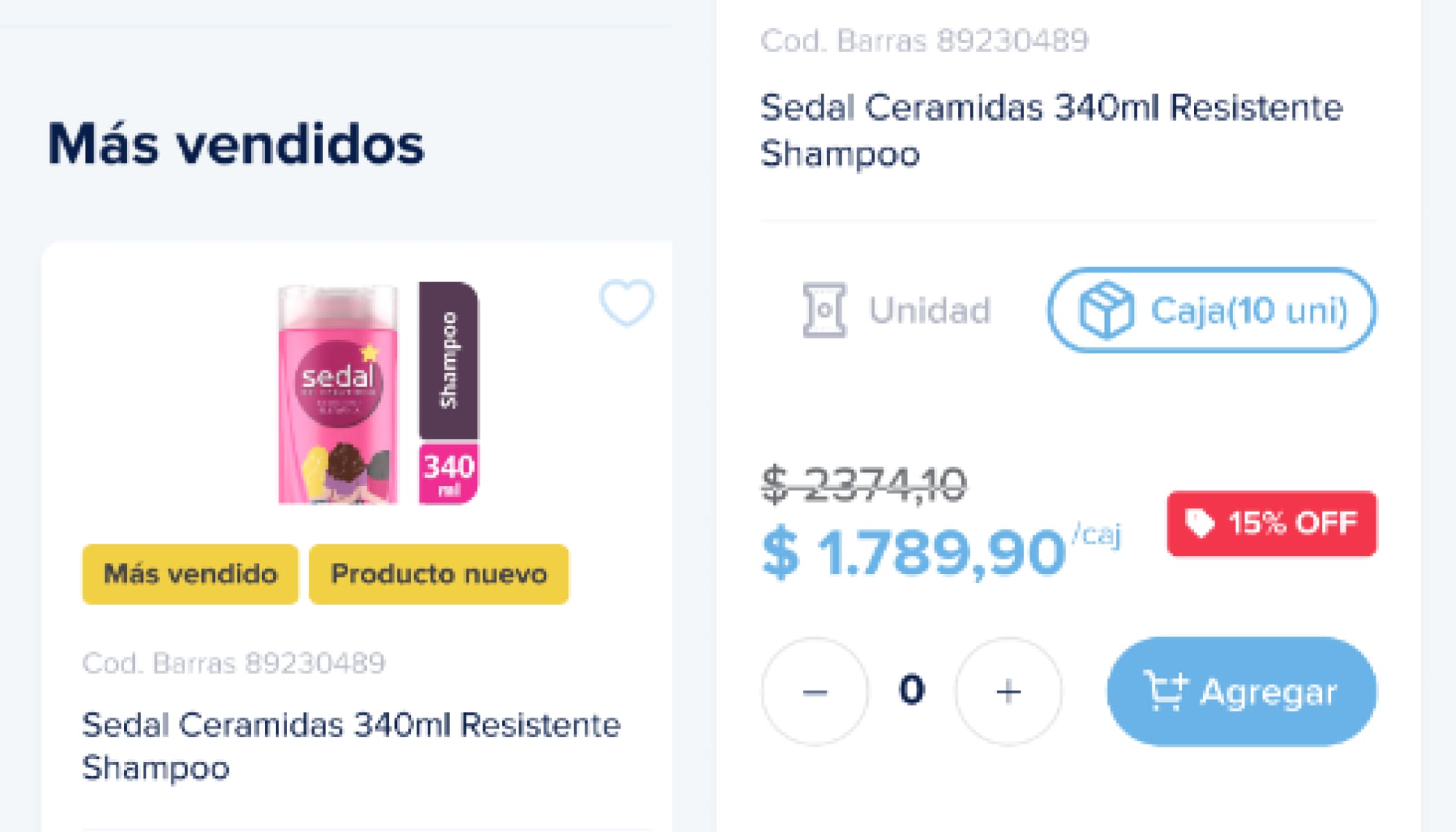
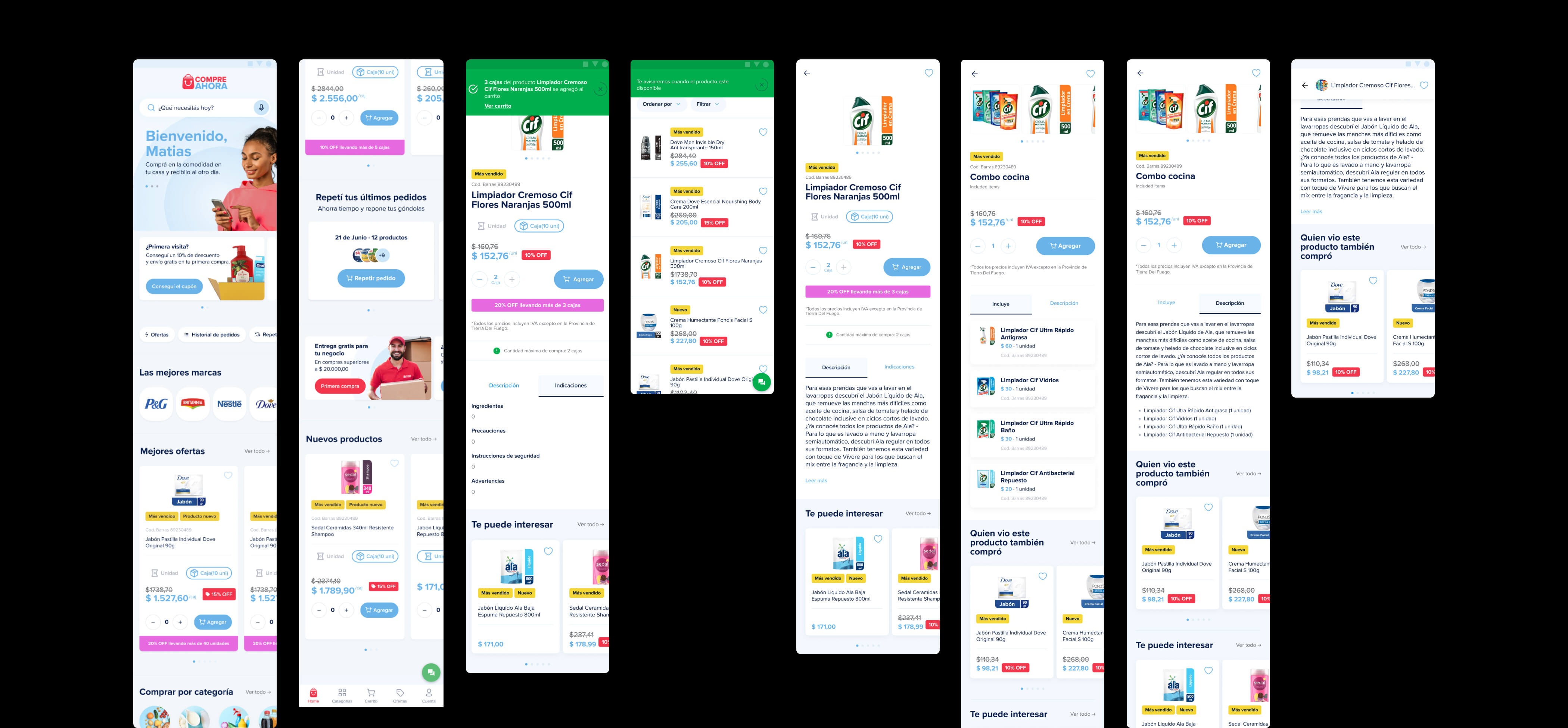
Design decision. "Best offers" and "top-selling products" got their own dedicated sections on the home screen, each card built around its description and discount.
Why. Putting proven, discounted products front and center nudges retailers toward items already working for stores like theirs, instead of making them dig for a deal.
02 Descriptions that answer the real question
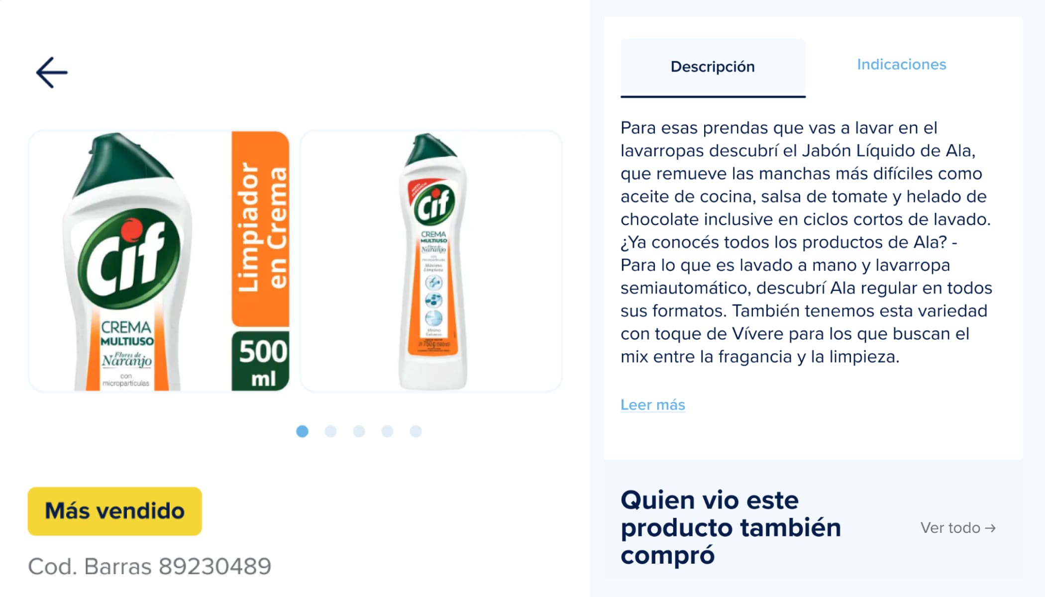
Design decision. Redesigned product detail pages to show more specific information, and added related products alongside each item.
Why. A retailer buying wholesale isn't committing to one unit. They're committing to a whole case for someone else's shelves. They need to be sure before it goes in the cart.
03 Built around how retailers shop
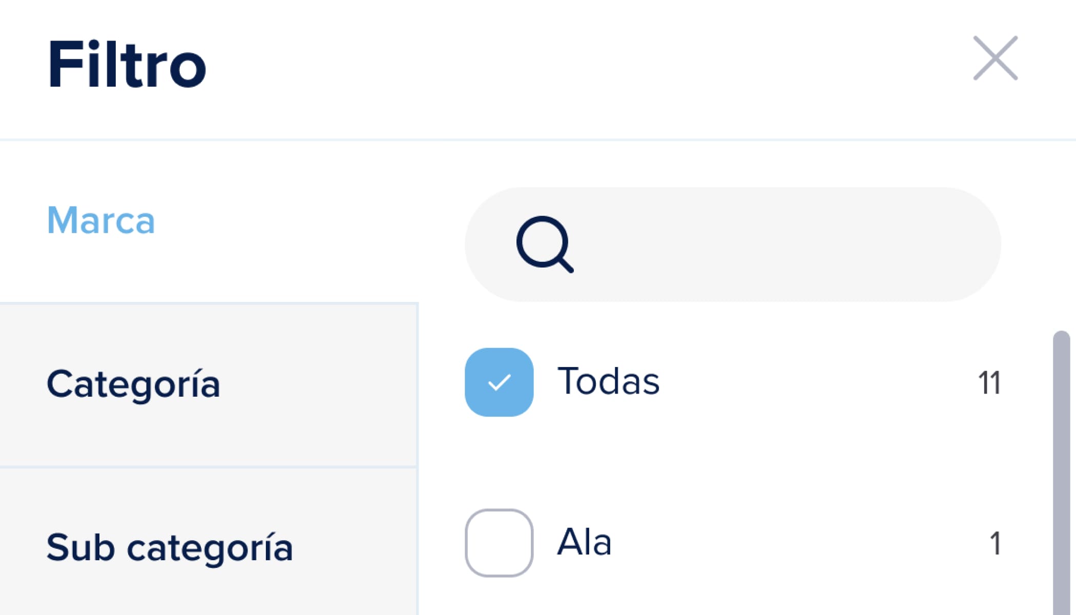
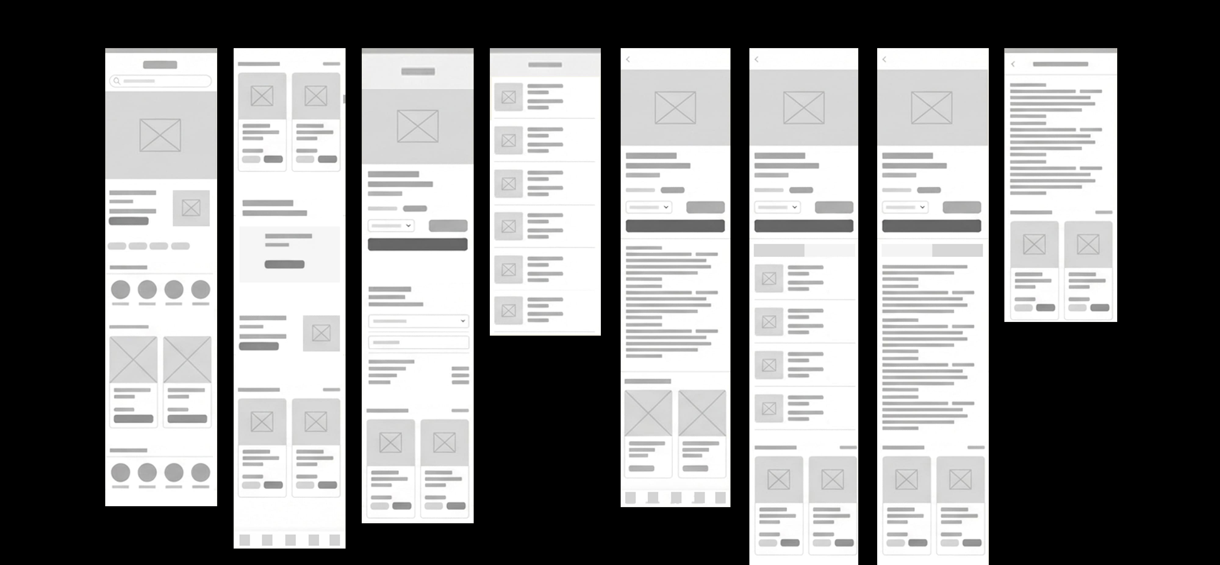
Design decision. Helped define the category structure and how categories are visualized in the app, then tested it with real retailers and Compre Ahora's own team.
Why. The goal was a faster, more obvious path from "I need cleaning supplies" to a full cart, without retailers giving up partway through searching.
 10
10
 11
11
 12
12
 13
13
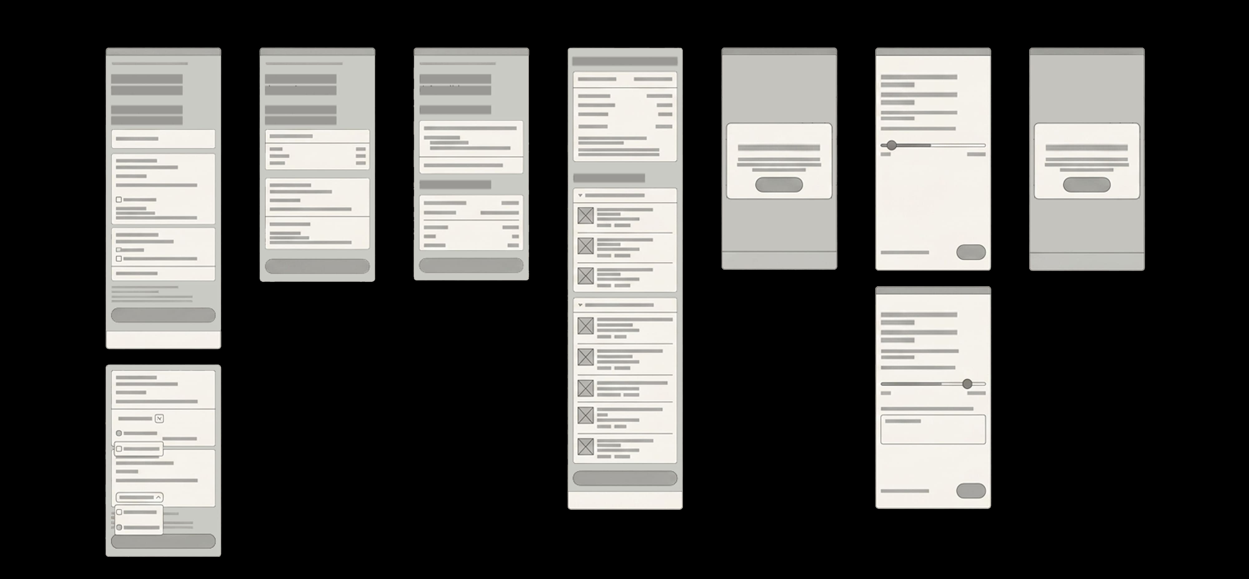
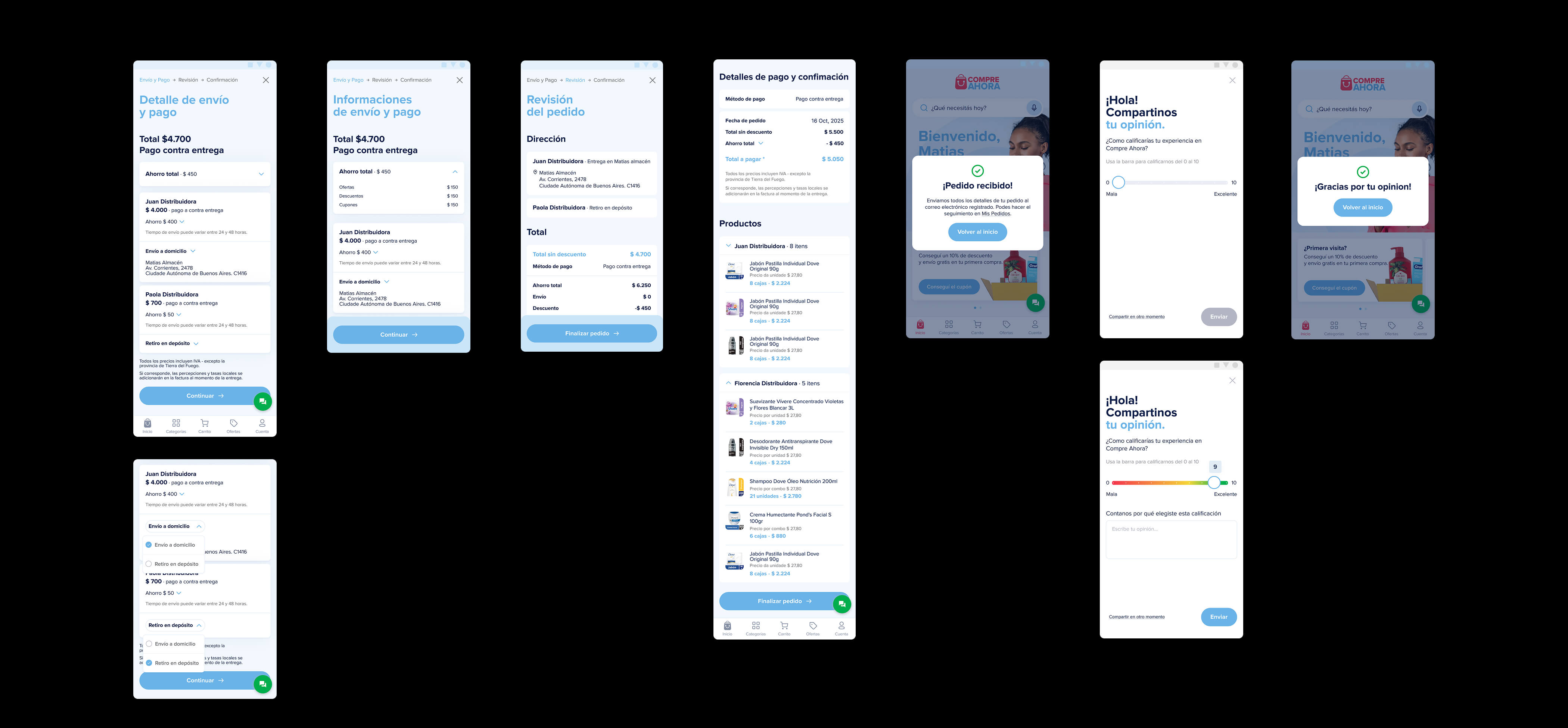
The cart was where a good experience used to fall apart.
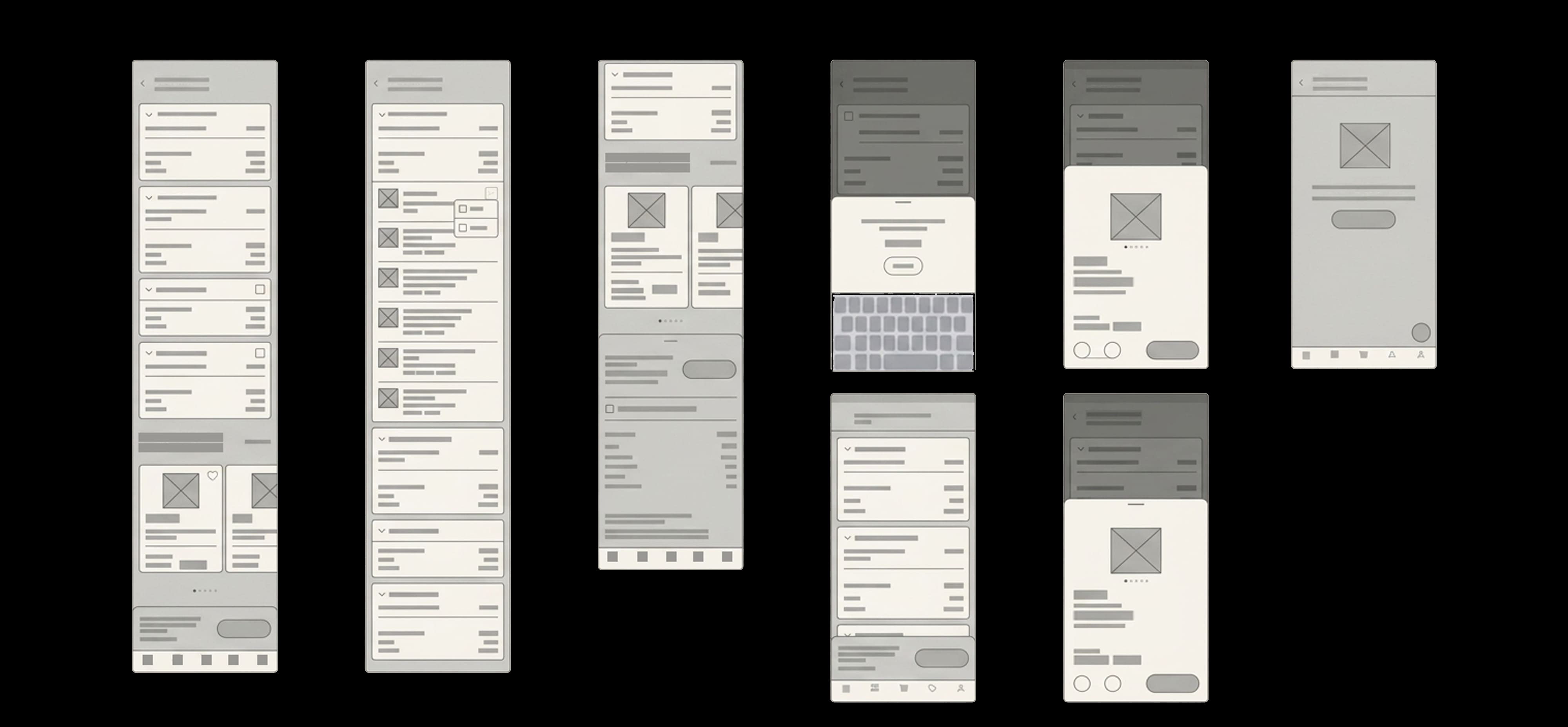
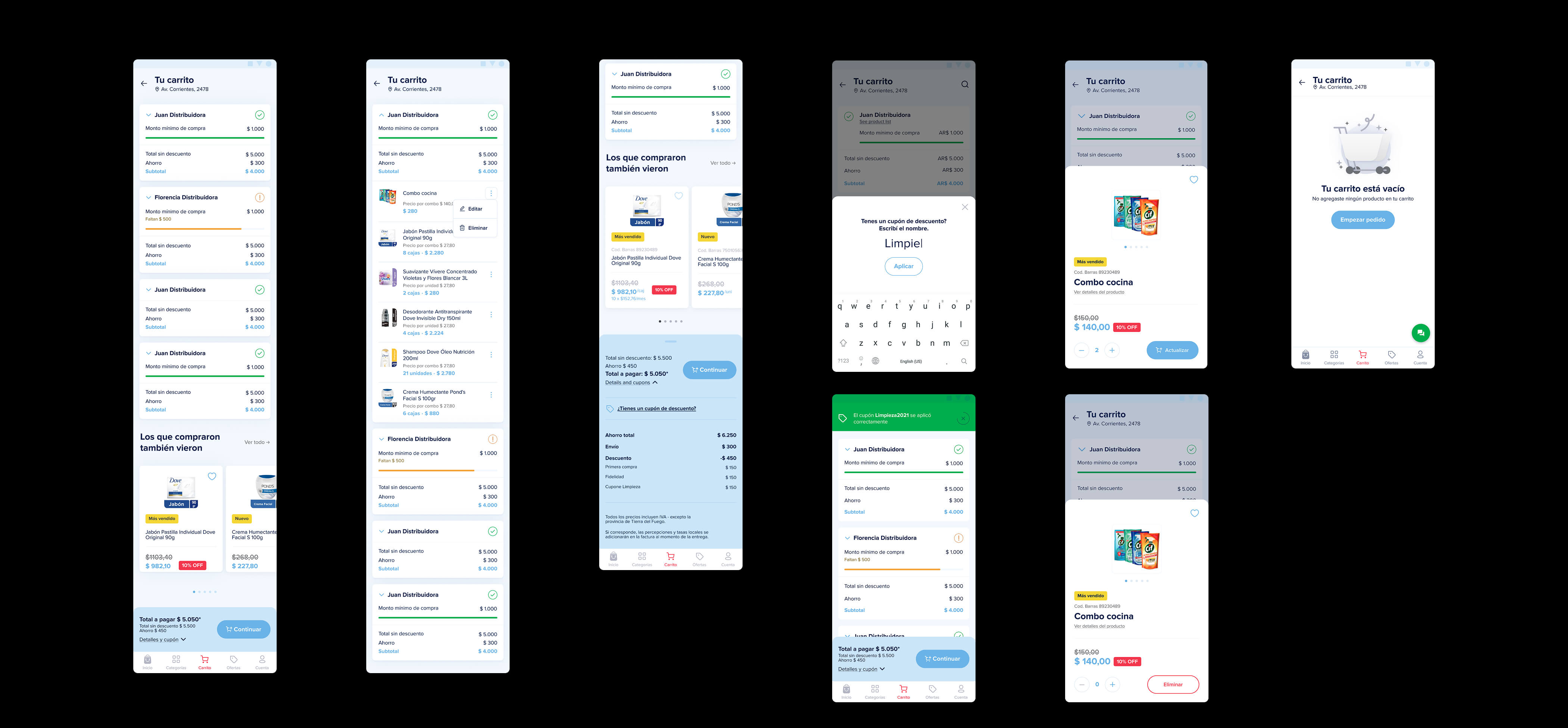
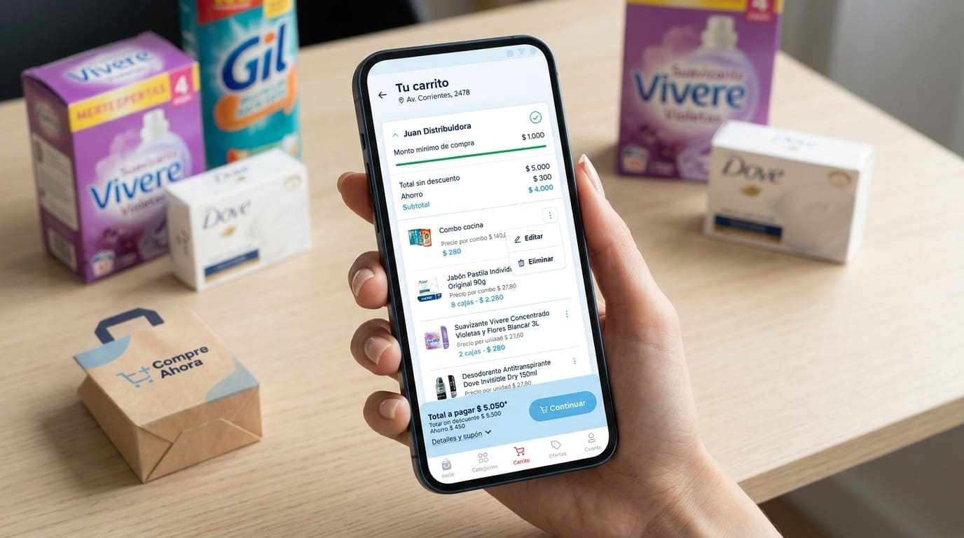
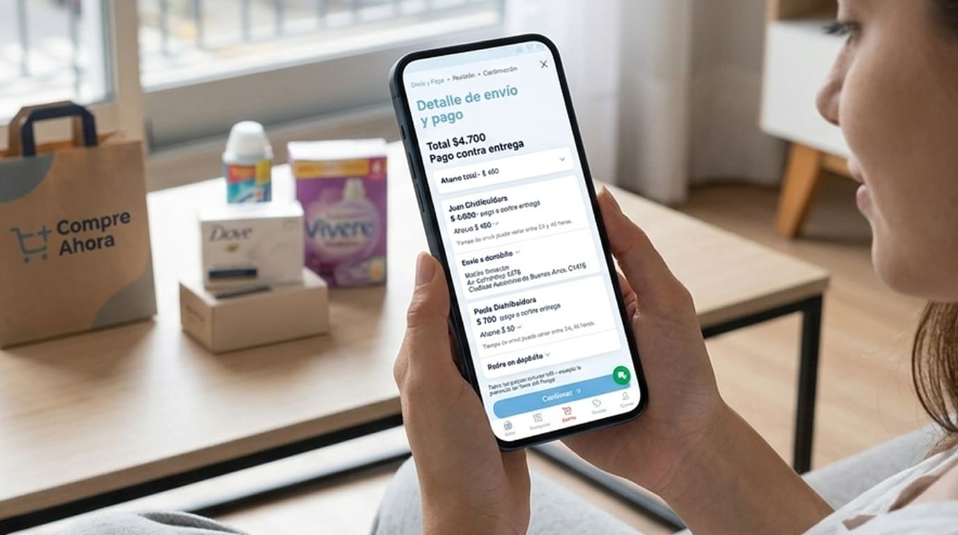
We redesigned the cart and checkout around how retailers shop. A single account can manage more than one store, so the cart makes clear which business is being restocked. Every line can be adjusted or removed in place, the minimum purchase amount stays visible the whole time instead of appearing at the end, and coupon codes plus the full price breakdown now live on the same screen rather than a step further on. We also simplified the payment and shipping details, to keep people from abandoning an order right before finishing it.
BeforeBuilding an order could take a while. A retailer shopping for more than one store, adding dozens of products at once, would only see the full price breakdown, or find out they hadn't hit the minimum, on a separate screen one step later. Fixing something meant losing your place.After
The cart shows which store is being restocked, every line can be edited in place, the minimum purchase amount stays visible the whole time, and coupons and the full price breakdown live on the same screen.
 15
15
 16
16
 17
17
 18
18
 19
19
 20
20
Learnings
- Live products don't pause for redesigns: every change had to keep working for retailers mid-order the moment it shipped.
- Checkout is never "just" checkout. For a business buying in bulk, clarity there mattered more than almost anything else.
- Localization is more than translation: it meant checking that trust signals carried across the language switch.
Next steps
- More languages: extending support to English for a smaller, growing group of retailers.
- Personalization: evolving "best offers" into recommendations based on a retailer's own order history.
- Multi-store checkout: continuing to simplify the flow for retailers managing several stores at once.
Most of this work has no single before-and-after screenshot. Retailers were placing real orders the whole time. For a shop owner checking their phone between customers, the win is rarely dramatic: one less screen, one clearer number, one less reason to give up on an order they'd already started.
Compre Ahora · AccentureMore work
Three more projects worth a look.
 01
01
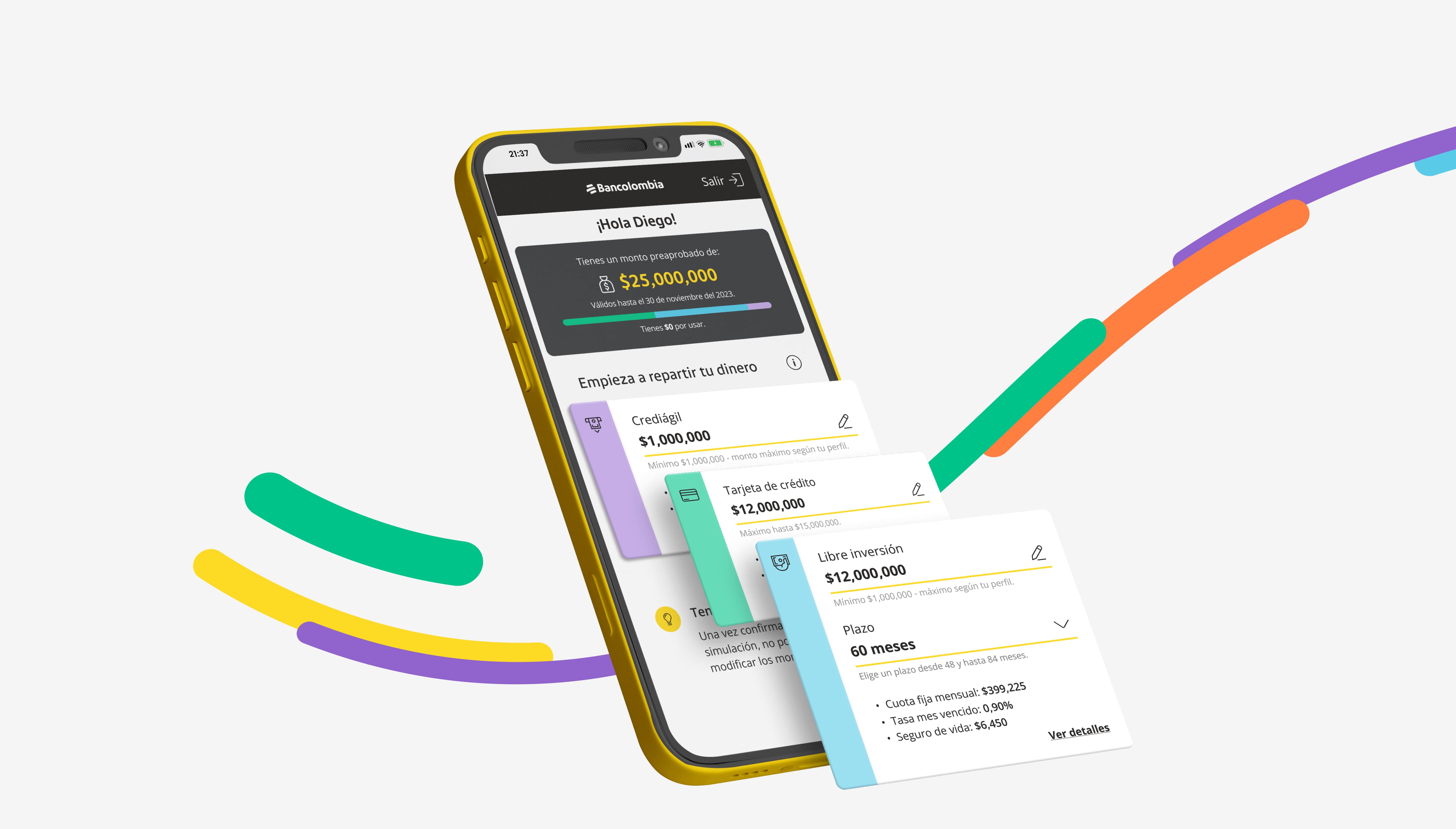
Pre-approved Loans
Simplifying pre-approved loan activation for Bancolombia's app and website.
 02
02
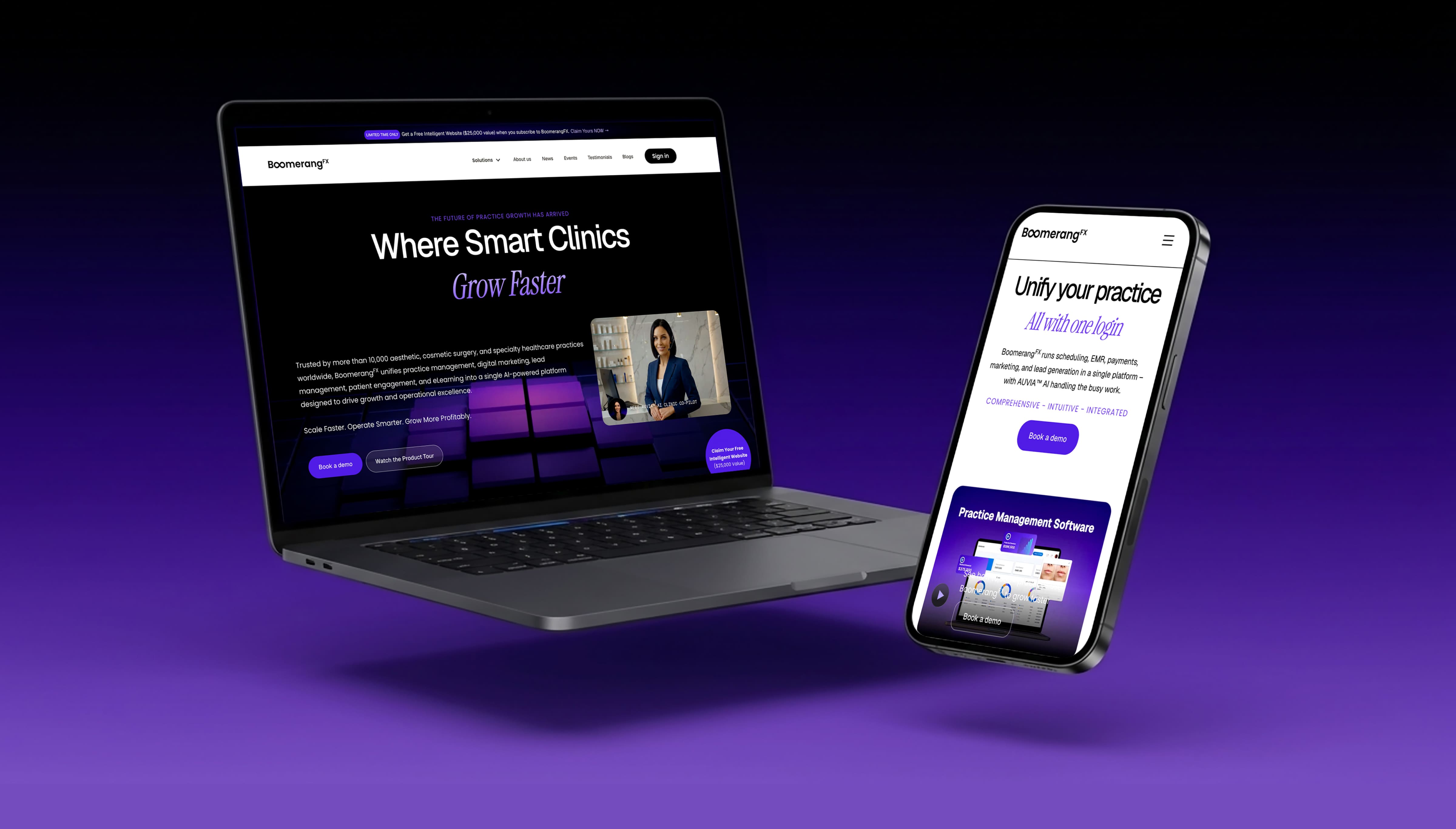
BoomerangFX
Refining the visual system and building a fully responsive site in Webflow.
 04
04
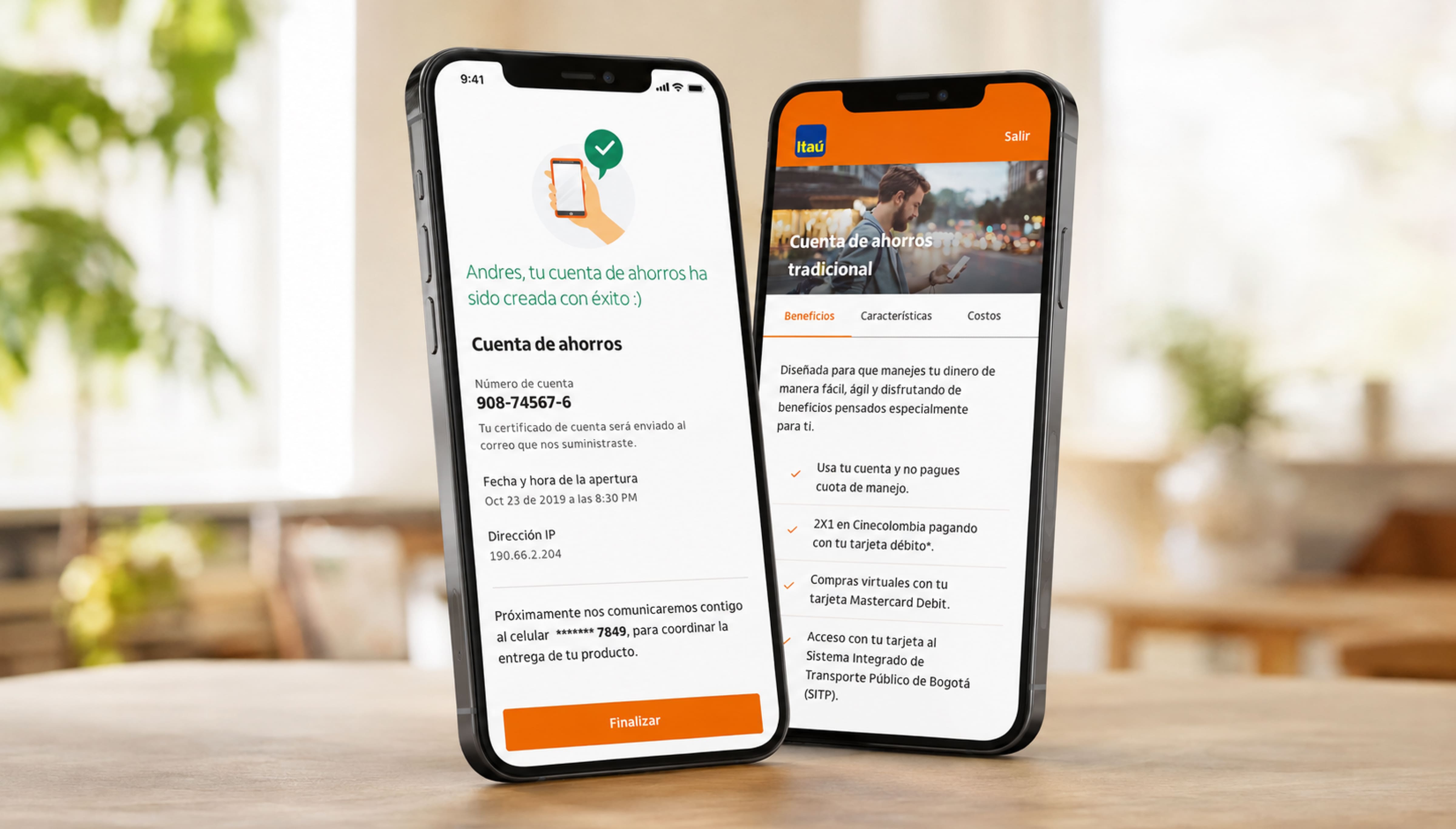
Digital Banking Products
Turning Itaú Colombia's branch-only products into flows customers finish on their phone.