
Technologically Resigned
Distrust digital tools and use them only when necessary. Limited access, low motivation, and difficulty learning new tools.
Turning a confusing loan process into a simple activation flow.
 01
01
Colombia's largest private bank, serving customers across Colombia, Panama and Puerto Rico.
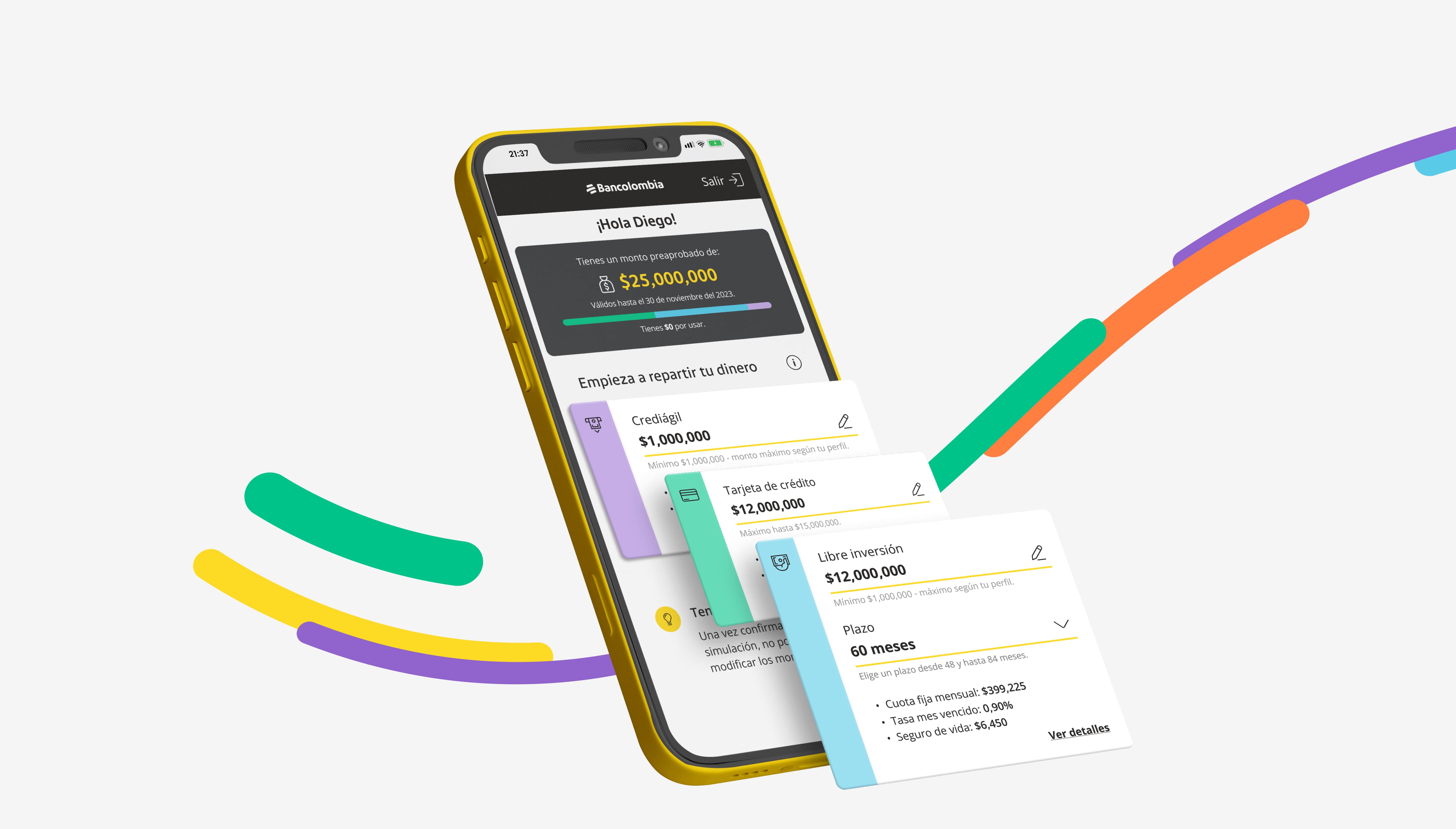
One simple path to activate a loan that was already approved.
The goal was to simplify the traditional multi-step loan application by giving customers several credit options and pre-approved offers they could access at any time. The result had to be a responsive web experience, connected to the bank's existing products, services, technology and design system, that felt like a natural part of its platform.
Led a five-person team and set the product vision and strategy for the experience.
Owned the relationship with the bank: client presentations, co-creation sessions and gathering new requirements.
Made sure the product met the bank's business goals while giving customers a clear, pleasant way to find and activate pre-approved loans.
Connected several separate credit products into a single process, avoiding long waits and information overload.
Guided the team through high-fidelity prototypes, usability testing and extensions to the bank's existing design system.
Understanding users, the bank's credit products and the market.
Defining the problem, the challenges and the first design decisions.
High-fidelity UI, prototyping and two rounds of usability testing.
Documentation and handoff to the bank's internal design and dev teams.
What was stopping people from finishing a loan they had already been approved for.
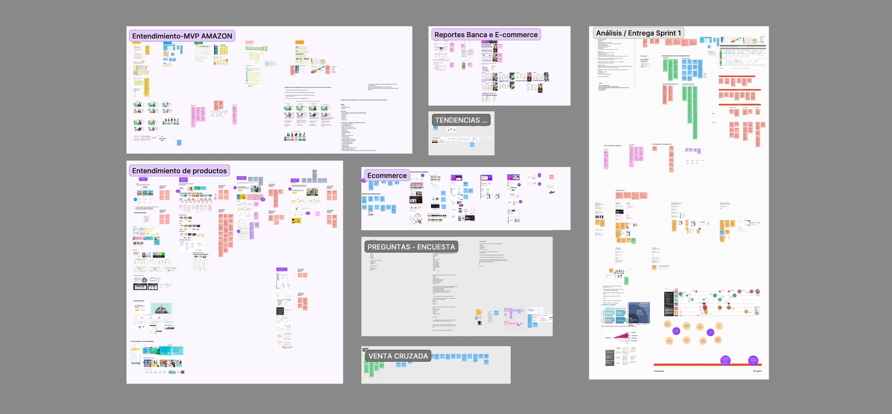
Starting from the client's brief, I looked at comparable projects with the internal team to define the product's direction: analyzing the bank's own customer profiles, learning the mechanics of each credit product, and gathering references and trends from the financial sector in other countries. A series of sessions with external e-commerce and banking experts rounded out the picture.
 03
03
Users need clarity on eligibility criteria, process status and loan terms: the three things the existing flow explained the least.
Banking jargon, the sheer number of required documents and steps, and the fear of mistaking a "simulation" for formal acceptance were driving abandonment.
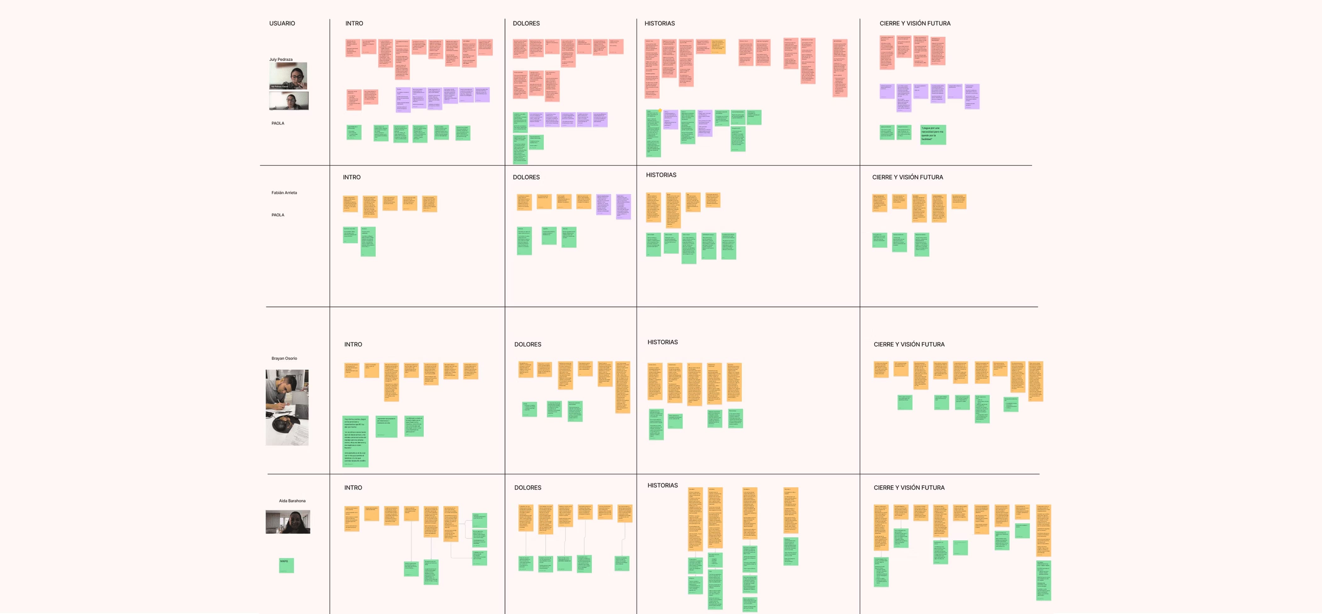
Customers couldn't easily see the steps of the credit process, weren't sure which product to choose, and were wary of even running a simulation.
Five ways people relate to digital banking tools, mapped to guide every decision that followed.
Distrust digital tools and use them only when necessary. Limited access, low motivation, and difficulty learning new tools.

Still learning to use digital tools. Interested in improving, but need guidance and time to adapt with confidence.

Use technology practically. Not enthusiasts, but comfortable with the basics and drawn to what's useful, fast and functional.

Explore and adopt new tools easily. High digital confidence and skill.

Manage digital and financial products with deep knowledge. Make informed decisions and optimize their own resources.
Bank users need a fast, clear way to understand their pre-approved credit status and a simplified application process, because the current system is opaque and slow. That lack of trust, plus the fear that simulating a loan is legally the same as accepting it, leads them to abandon the process before ever formally applying.
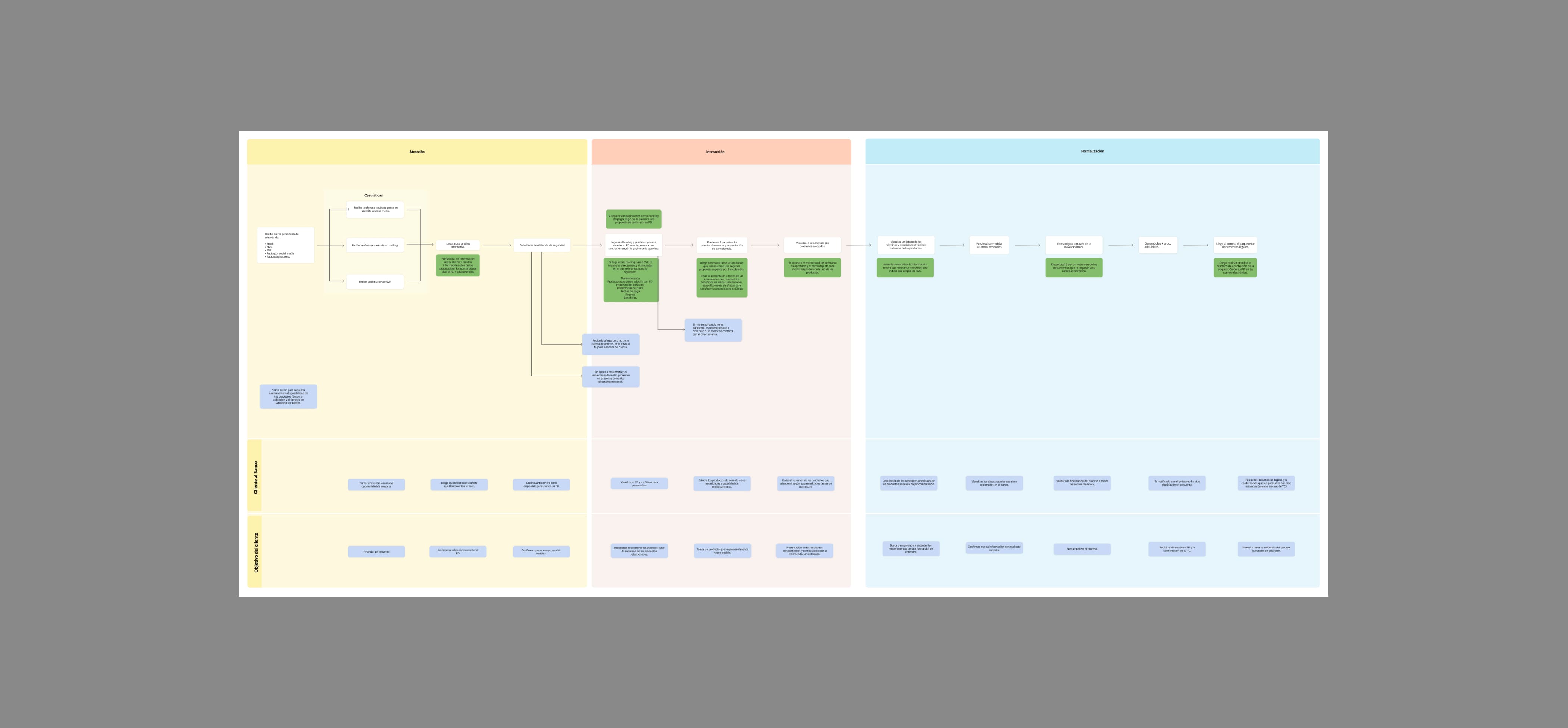
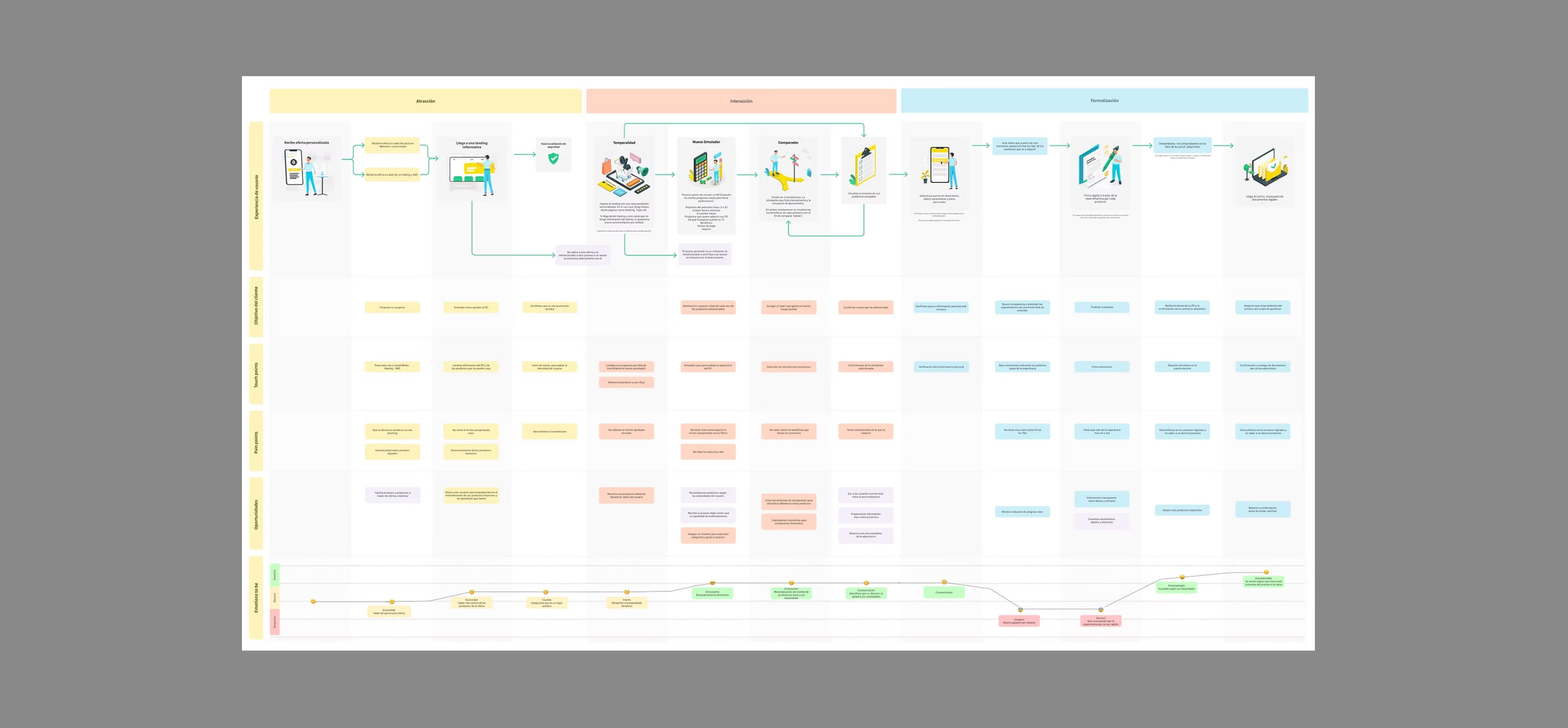
We mapped the end-to-end customer journey, from initial attraction to final formalization, marking specific pain points, friction alerts and key moments of truth. That map is what let us merge several disparate product processes into one experience, and propose a single, streamlined happy path for getting a loan.
 04
04
 05
05
Three decisions that reshaped the flow.
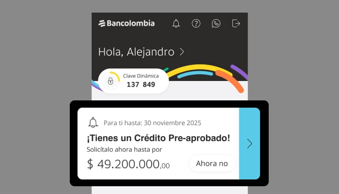
Design decision. A prominent "Check your pre-approval" component placed directly on the dashboard's main screen.
Why. Placing it inside the account-movements section, where users already spend most of their time, turns it into a highly visible call to action. It leans on reciprocity (the bank has already offered them something) and simplifies the entry point into the loan flow.
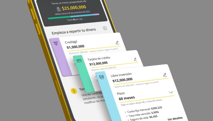
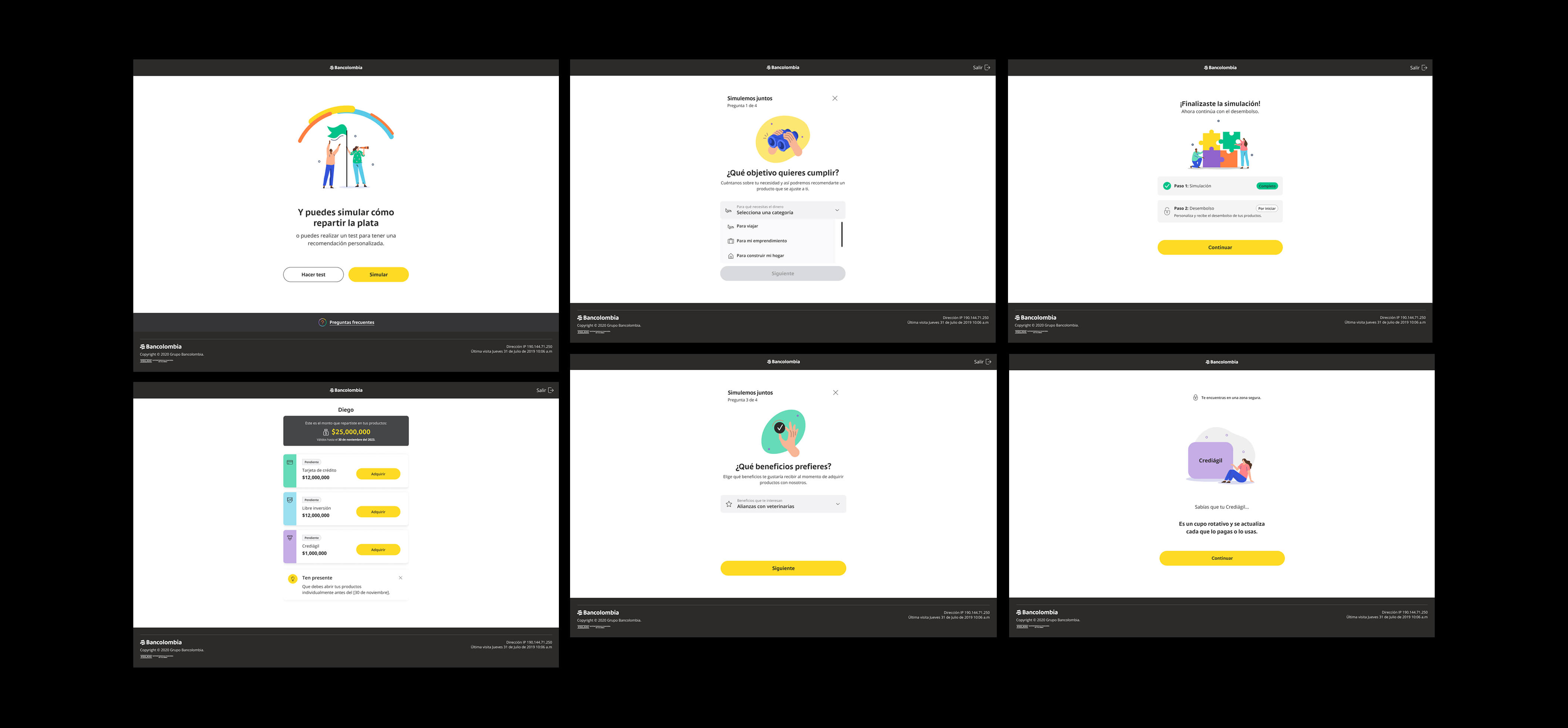
Design decision. A short quiz to recommend the right product, paired with a simple, intuitive simulator.
Why. Many customers didn't know which product fit their needs. The solution combined a short quiz, visual aids before the simulation starts, a dedicated FAQ, a dynamic simulator that lets people split the pre-approved amount across products, and absolute clarity that simulating is not committing.
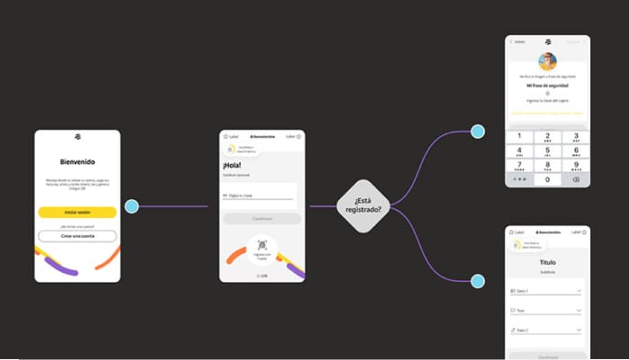
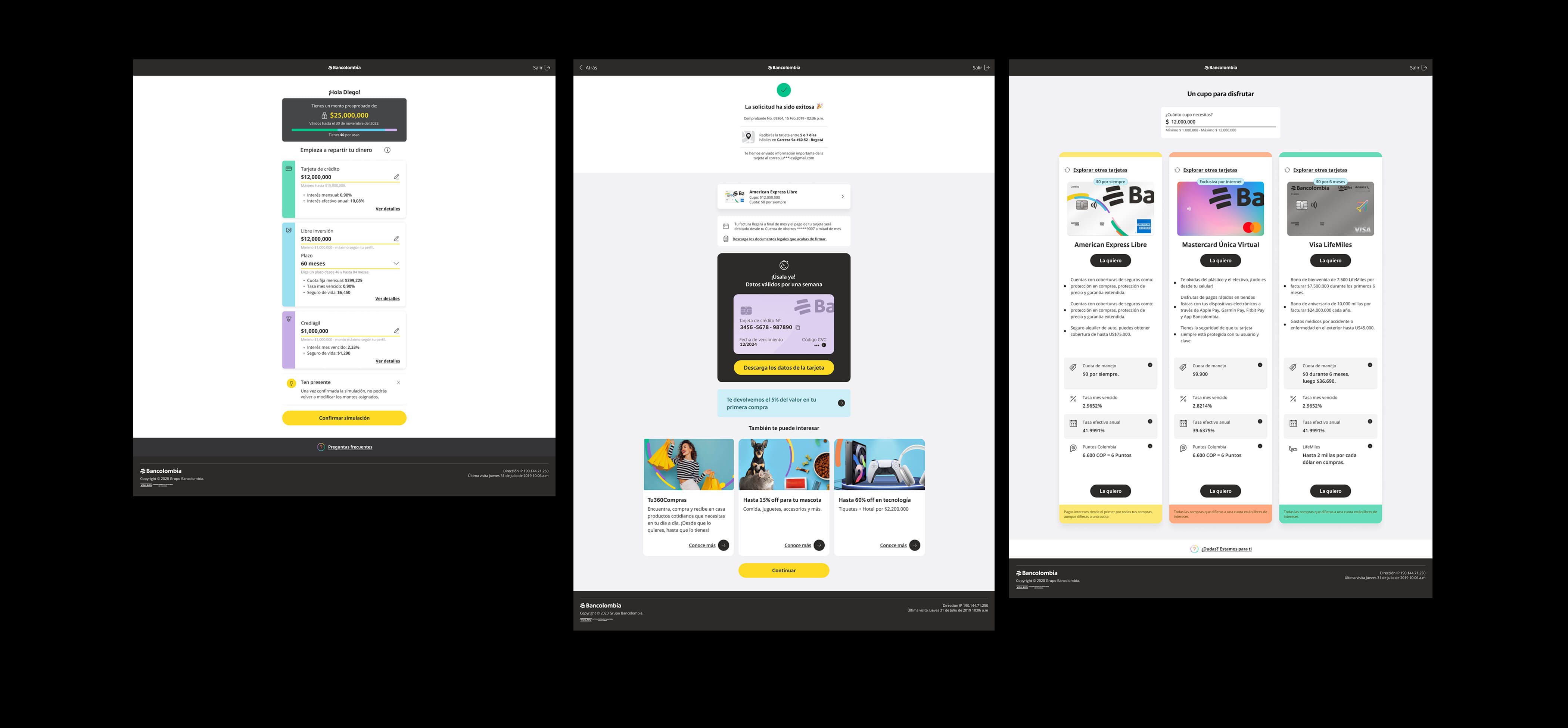
Design decision. Reduce the multi-step form by reusing data the bank already has.
Why. If a loan is pre-approved, most of a customer's data (identity, income) is already in the system. Asking for it again is pure friction.
Shown right on the dashboard, no digging through menus.
A short quiz points to the right product.
The simulator lets people adjust the numbers freely.
One confirmation, using data the bank already has.
The product is live and ready to use right away.
Built inside Bancolombia's own design system, not around it.
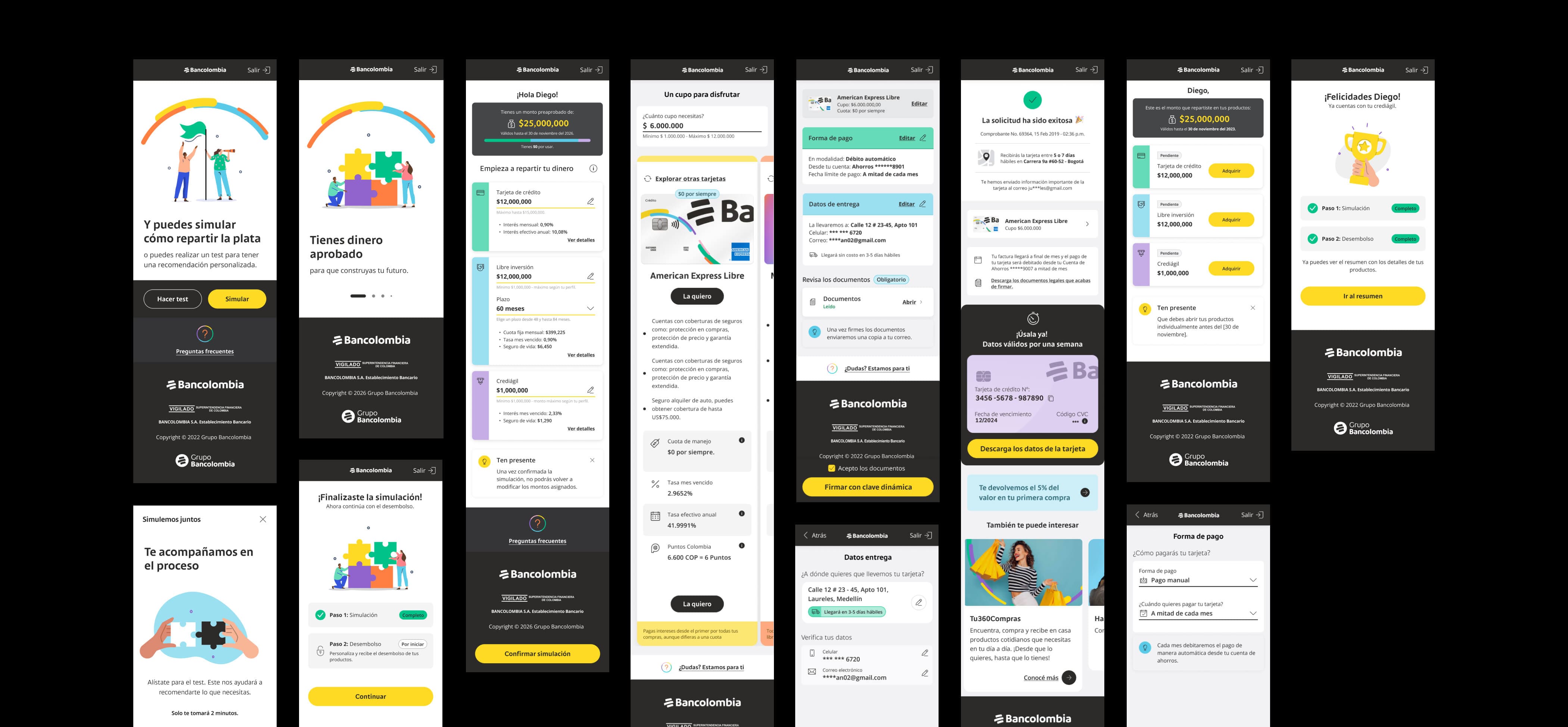
The new main flow gives users with a pre-approved offer direct access from the dashboard, instead of forcing them through generic "Products" and "Loans" menus. We then folded the acquisition flows of every existing credit product (credit cards, personal loans, general-purpose loans) into this same pre-approved path, cutting steps so people could apply to more than one product in minutes.
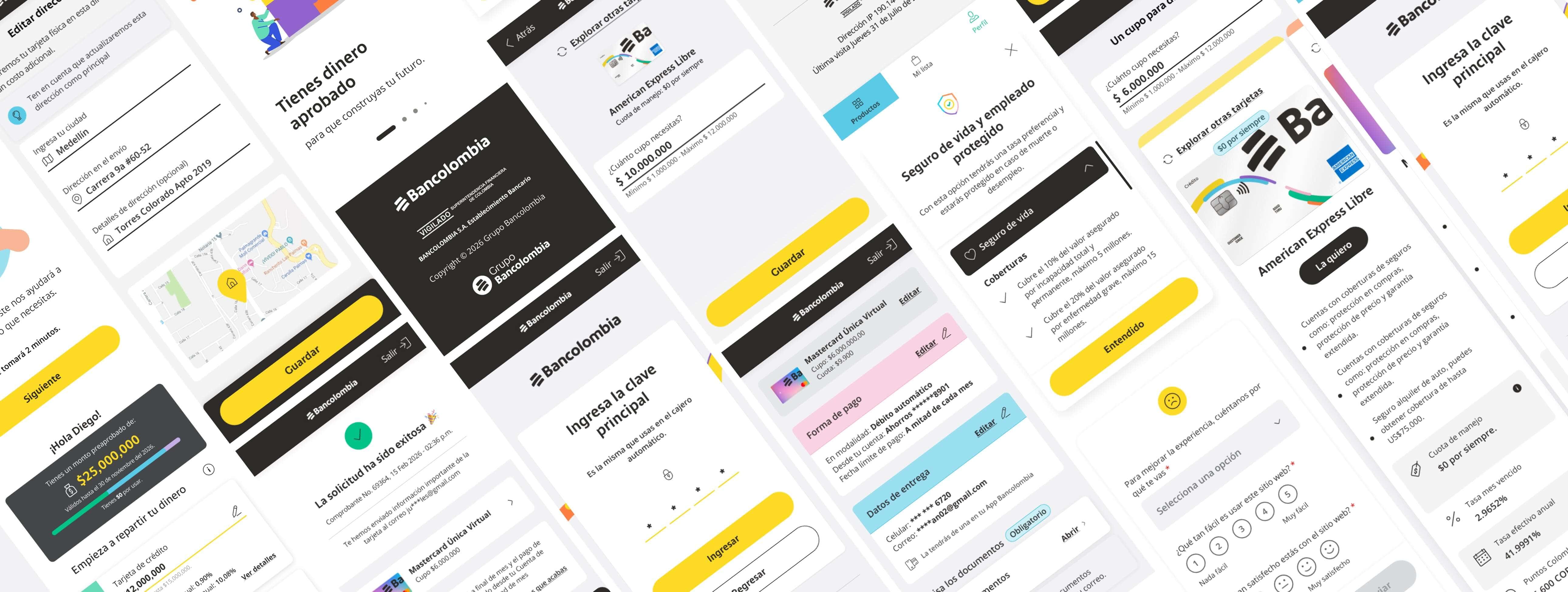
Every new component started from Bancolombia's existing pattern library rather than a blank canvas: extending typography, color and component rules the internal team and returning customers already knew, instead of introducing a parallel visual language just for this flow.
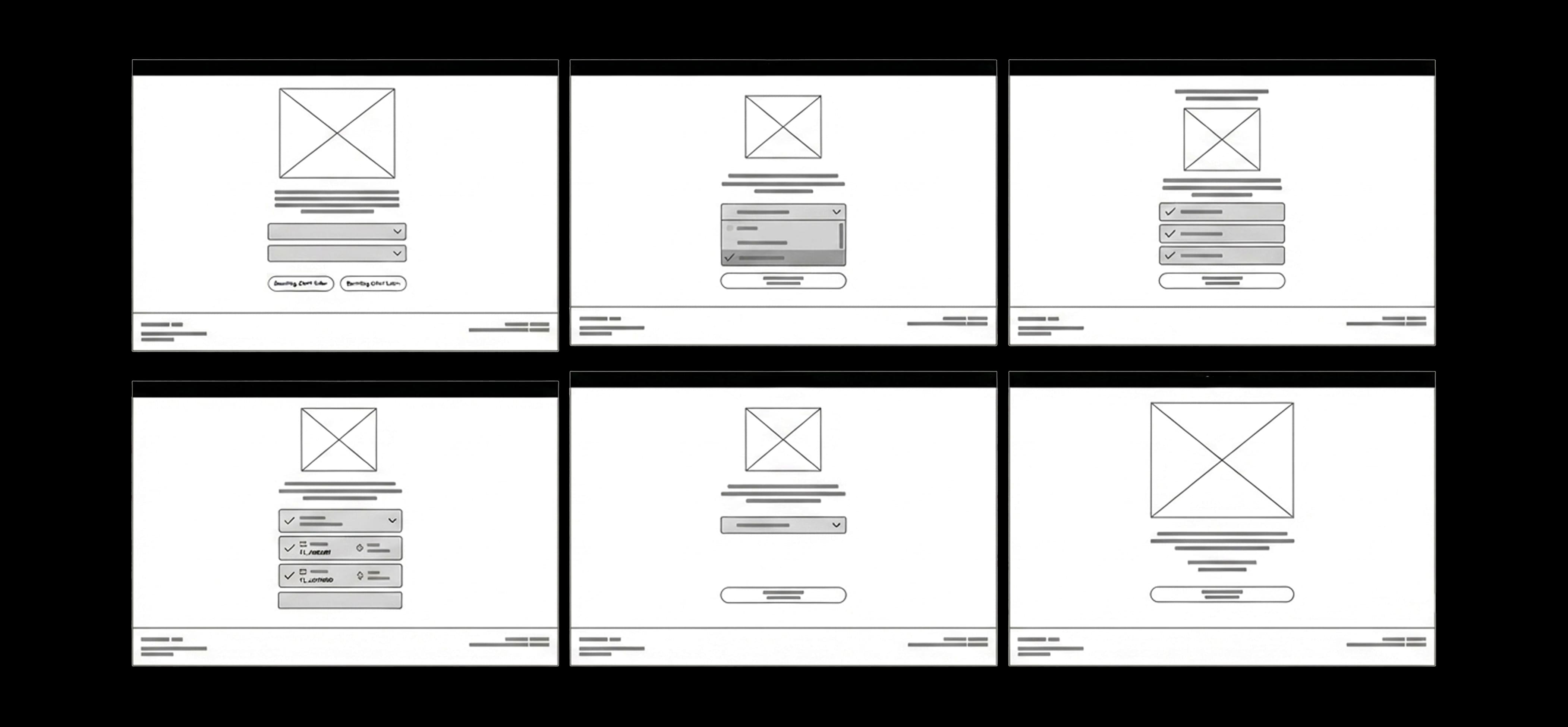
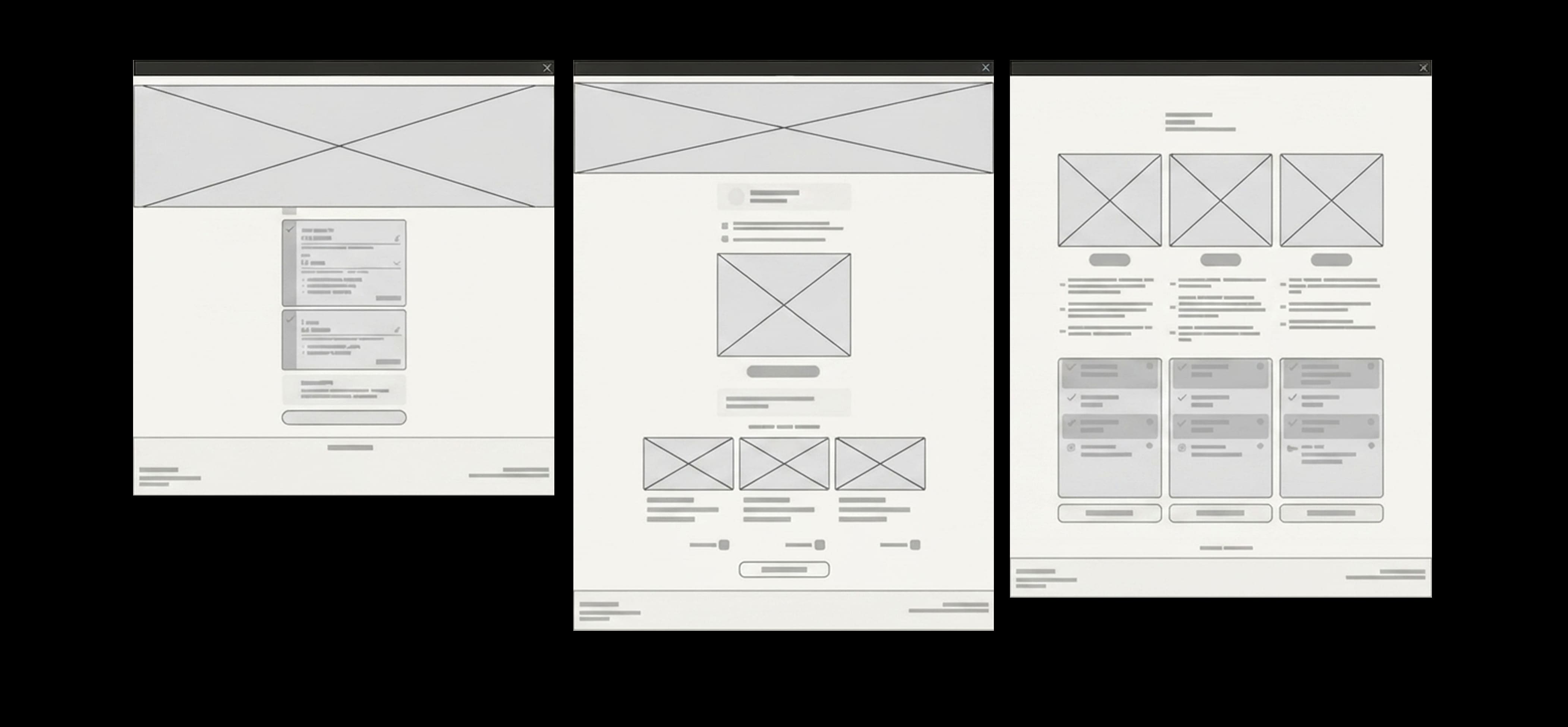
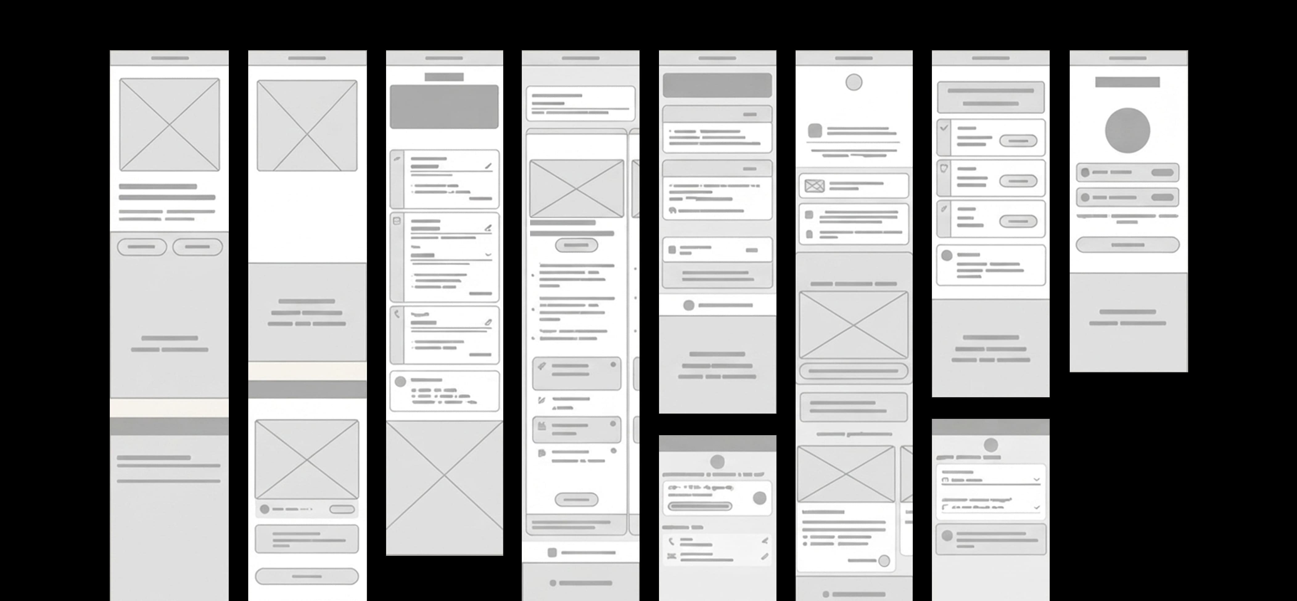
Wireframes were created to validate the content structure with internal stakeholders, ensuring all legal information and customization options (amount, term, conditions) were clear and present before moving to final UI. Crucially, we ensured the existing credit product flows could easily merge with this dynamic pre-approved product.
 08
08
 09
09
 10
10
 11
11
 12
12
 13
13
Two rounds, two very different kinds of feedback.
Participants with no existing products inside the dynamic pre-approval ecosystem.
Users who already held one or more of the products currently offered through the pre-approval flow.
This archetype was excluded because the product was fully digital. It was built for customers who were already comfortable with technology and familiar with the bank's digital products.
Key metric. Clarity of information.
Finding. The simulator left some doubts about how to edit the amount and details of each product. The test was well received, but felt too long.
Iteration. Simplified the copy for clarity, added FAQs, introduced visual aids to guide people through the simulator, and surfaced key information (rates, terms, benefits) directly on the simulation screen.
Key metric. Time to complete the pre-approved application.
Finding. Information was clearer and easier to follow, and the simulator was well received, but some users wanted product benefits to be more visible during simulation.
Iteration. Added each product's details and benefits inside an informative modal, accessible directly from the simulation screen.
 14
14
In final testing, users described the application as more modern, intuitive, transparent and customer-centric than before.
 15
15
After presenting the project and co-creating with the bank across every sprint, running user tests and refining the design at high fidelity, we handed the project to the bank's internal design team. From that point, they own implementation, ongoing iteration, and documentation together with developers and other stakeholders.
Bancolombia · AccentureThree more projects worth a look.
 03
03
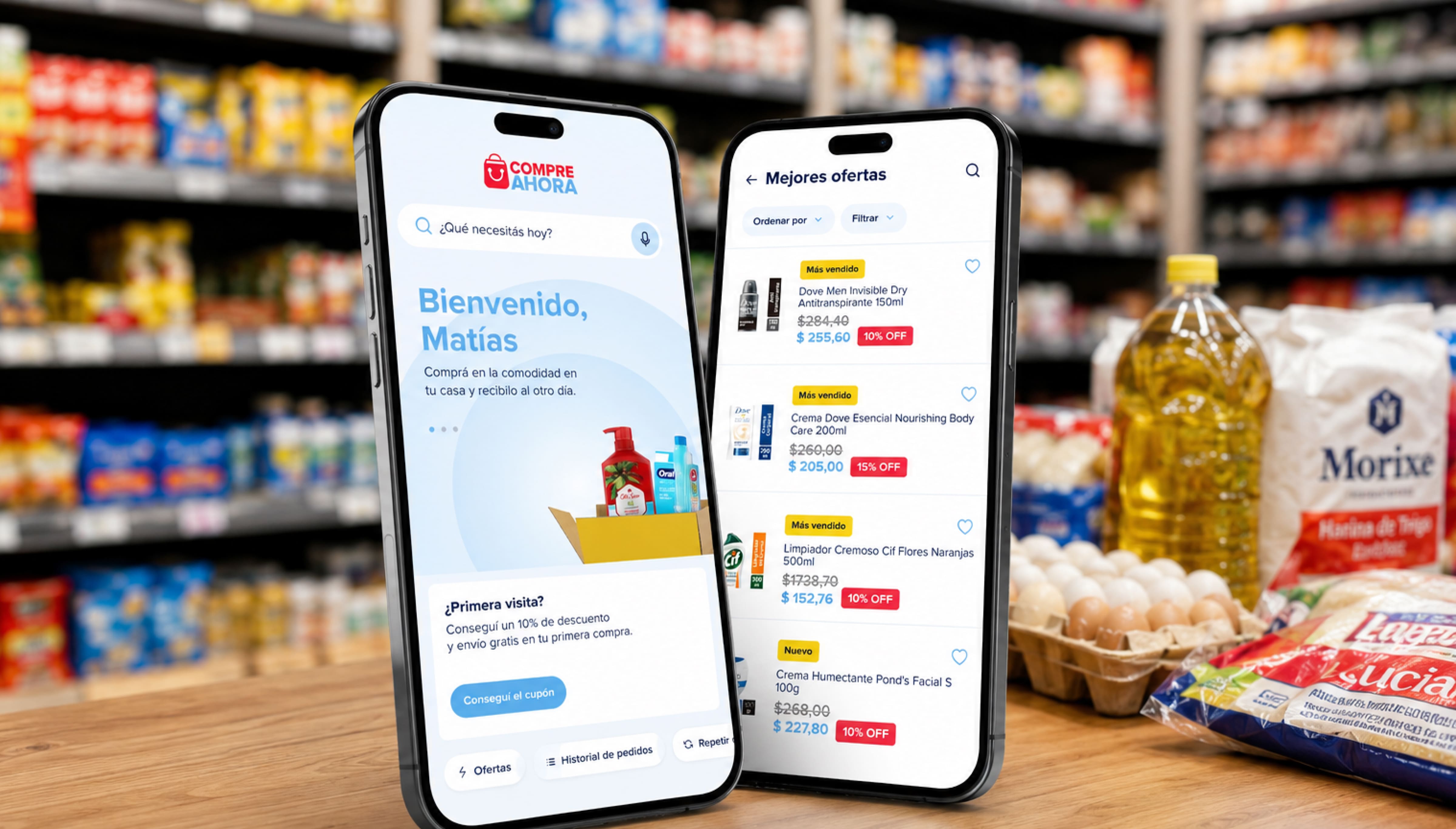
Helping small retailers across Argentina restock their stores from their phones.
 02
02
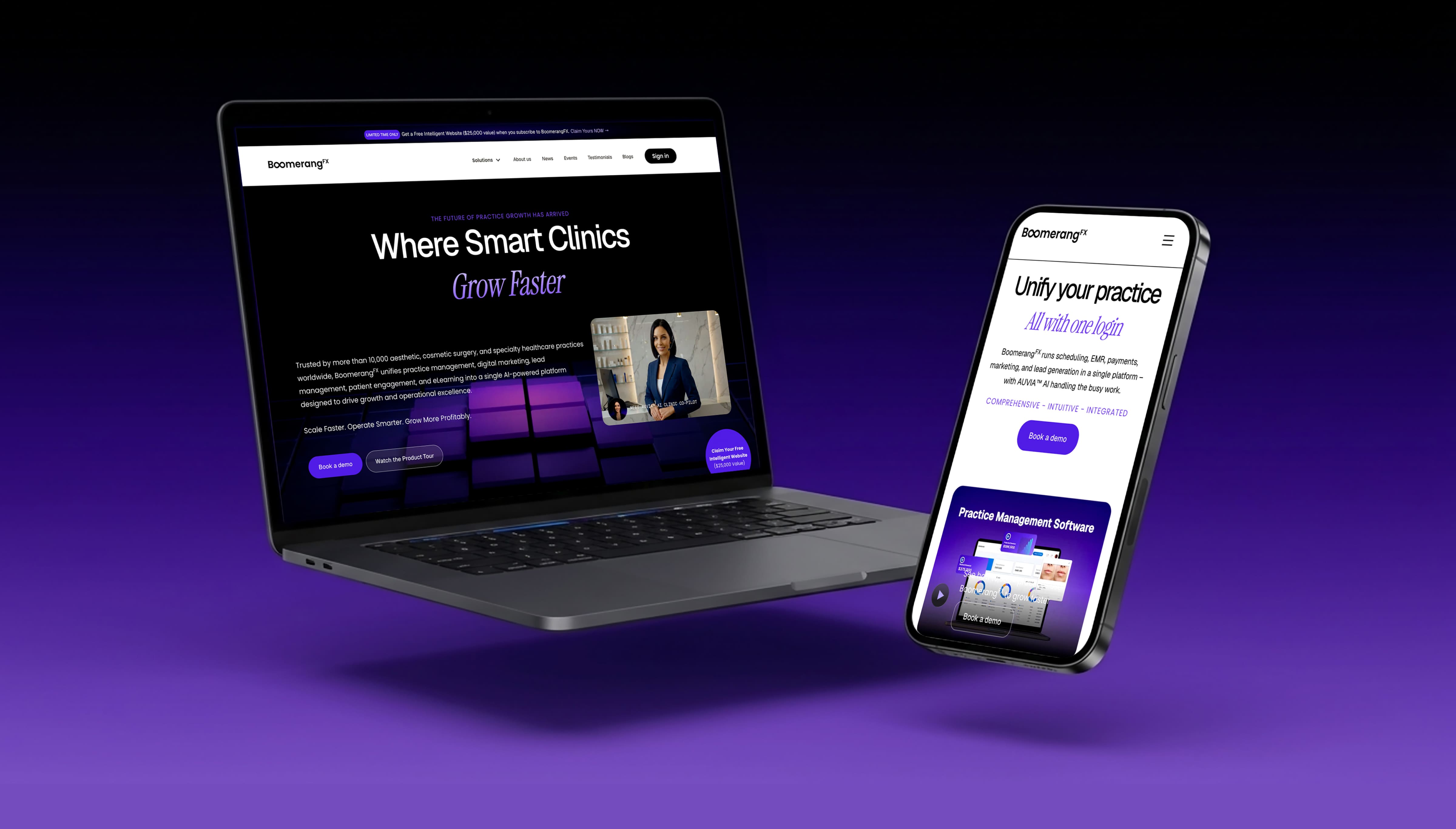
Refining the visual system and building a fully responsive site in Webflow.
 04
04
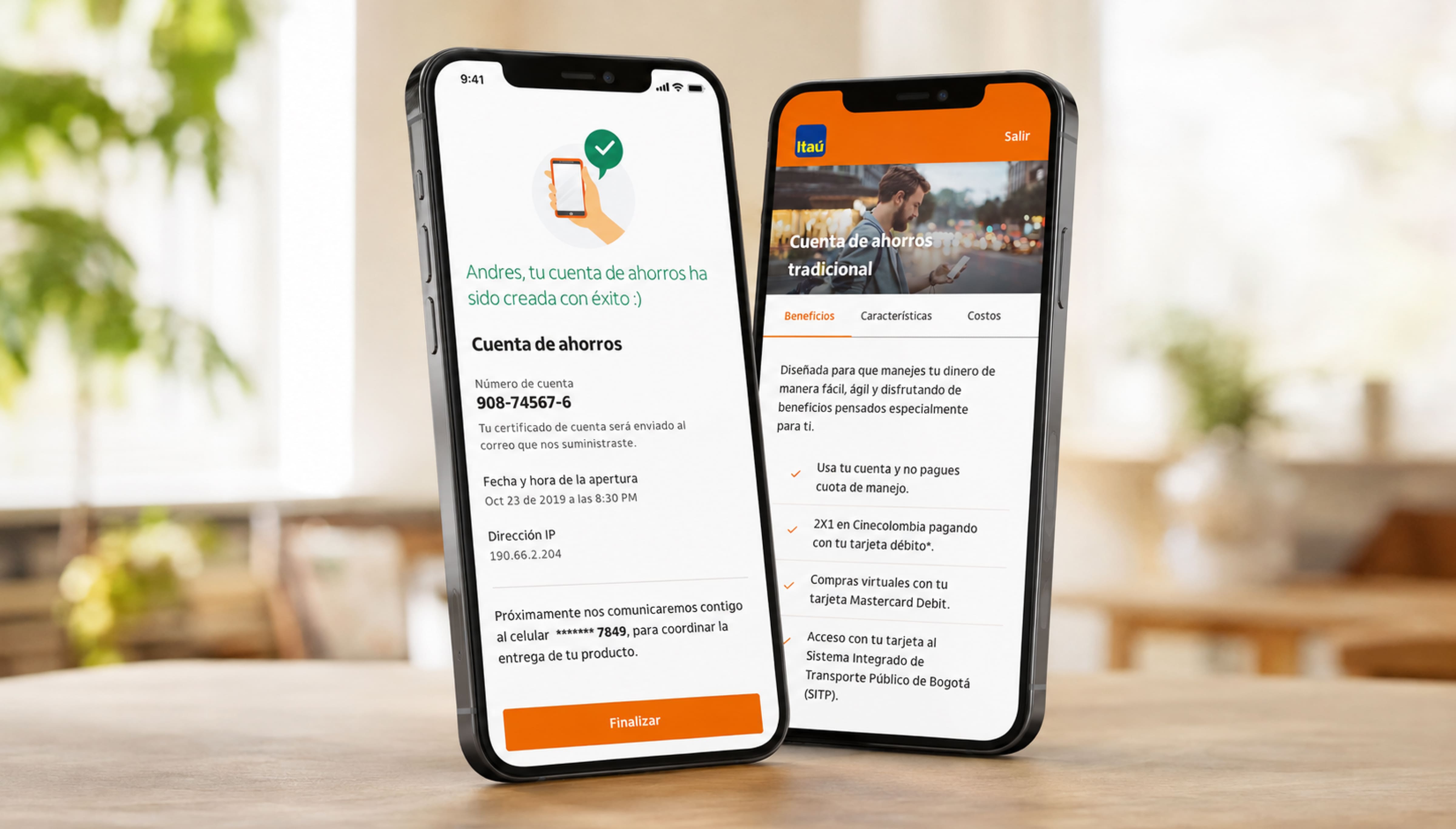
Turning Itaú Colombia's branch-only products into flows customers finish on their phone.