Digital Banking
Products
Redesigning how Itaú Colombia customers acquire core banking products: from a branch-only process to one they finish on their phone.
 01
01
Itaú's retail banking arm in Colombia, which offered savings accounts, credit cards, and personal and home loans nationwide.
Getting a bank product shouldn't require a trip to the branch.
Itaú is Latin America's largest private bank by assets, with a presence in 18 countries. Its Colombia operation is newer: it grew out of a 2012 acquisition of Santander's local business, merged with Helm Bank the next year, and started operating fully under the Itaú brand around 2017.
Rates were competitive, especially on housing and personal loans, but the digital side hadn't caught up. Because the bank was assembled from three merged institutions, getting almost any product still meant a branch visit and paperwork. I joined the team rebuilding those processes end to end, from 2021 to 2023, so customers could complete them from the app.
The user research and testing behind these products were run by Itaú Colombia's own UX team, and that data stays confidential to the bank. My part picked up from there: turning research findings and existing branch processes into clear, buildable flows, which is what this case study shows.
In 2026, Itaú Colombia transferred its retail banking business to Banco de Bogotá. This case study reflects the work as designed between 2021 and 2023.
My role
Worked hand-in-hand with Itaú Colombia's product team from 2021 to 2023, alongside UX, marketing and development.
Turned research findings and branch processes into wireflows, mapping every step clearly enough for every team to build from the same source.
Built prototypes from those wireflows for the development team to implement inside the bank's existing systems.
Worked on error, alert and confirmation messaging, and on removing steps and data requests that weren't strictly necessary.
Four products, one shared structure.
Every product followed the same five-stage backbone, mapped for both new and existing customers.
One flow, mapped stage by stage.
Every product branched differently once you were inside it. Here's the credit card flow for an existing customer, used as the representative example: the other products followed the same structure with different content at each stage.
-
1
Request
Home screen, then the product page: a returning customer already sees benefits, features and costs before deciding.
-
2
Identification
A politically exposed person (PEP) check runs automatically in the background, followed by a confirmation code.
-
3
Capture
Confirm occupation, update personal data, and see the credit limit already being offered.
-
4
Configuration
Choose a payment date, pick a card network, confirm delivery address, review everything.
-
5
Linking
Full product details, terms and conditions, and a final acceptance screen.
Across the products
Savings Account
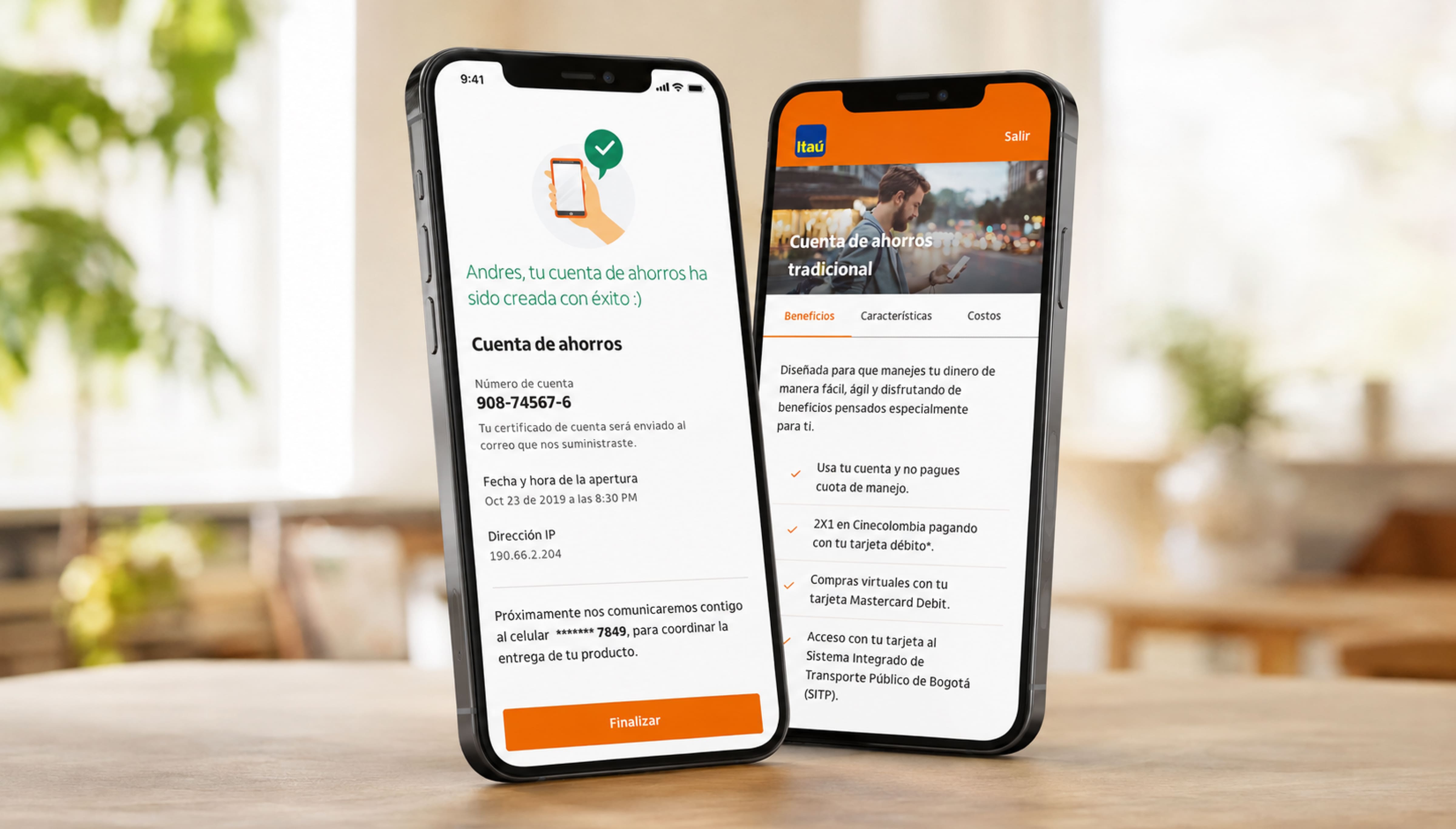
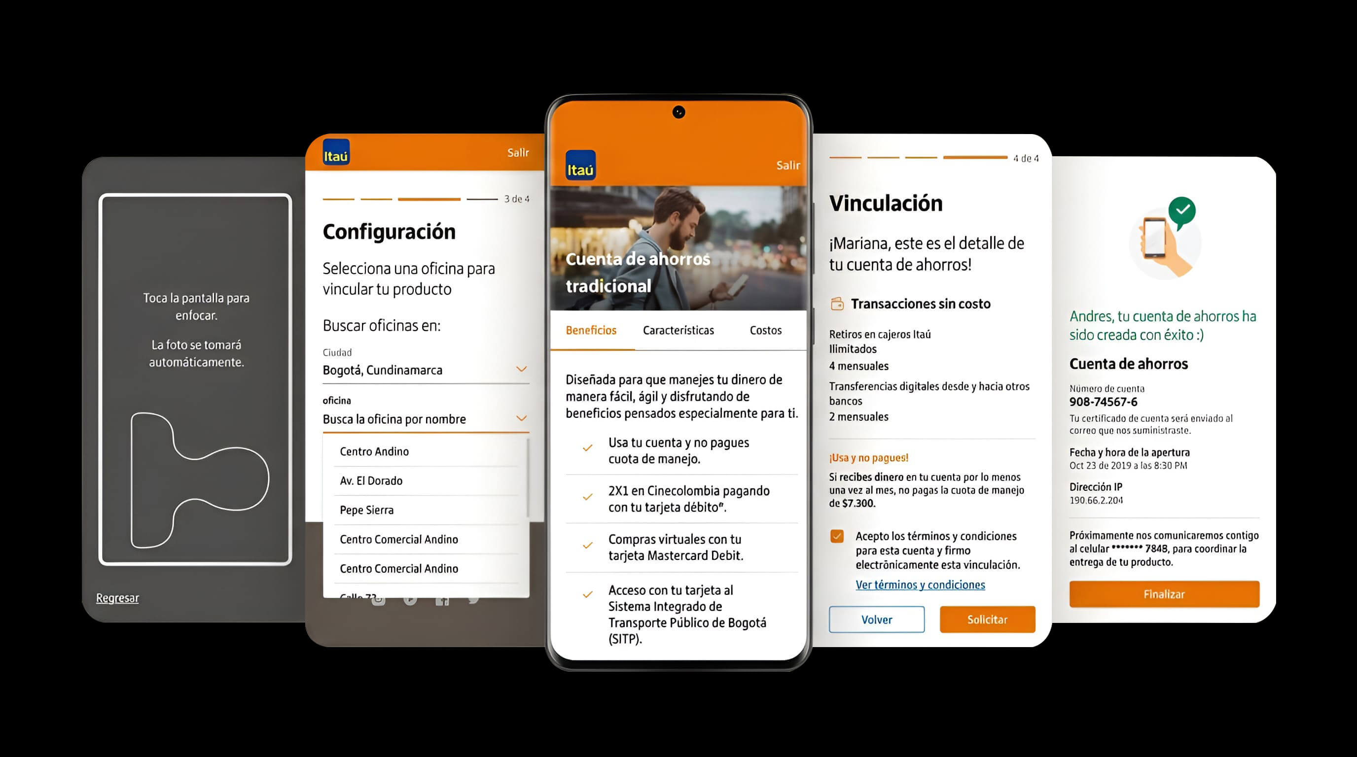
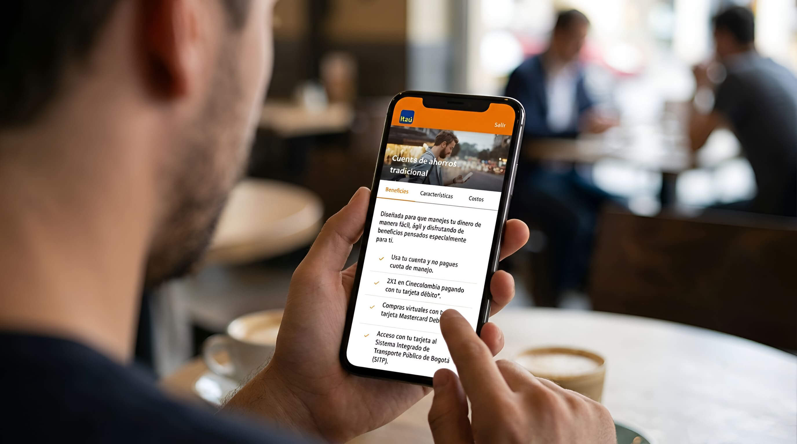
A digital account-opening flow, from product selection to a fully linked account, without a branch visit.
 04
04
 05
05
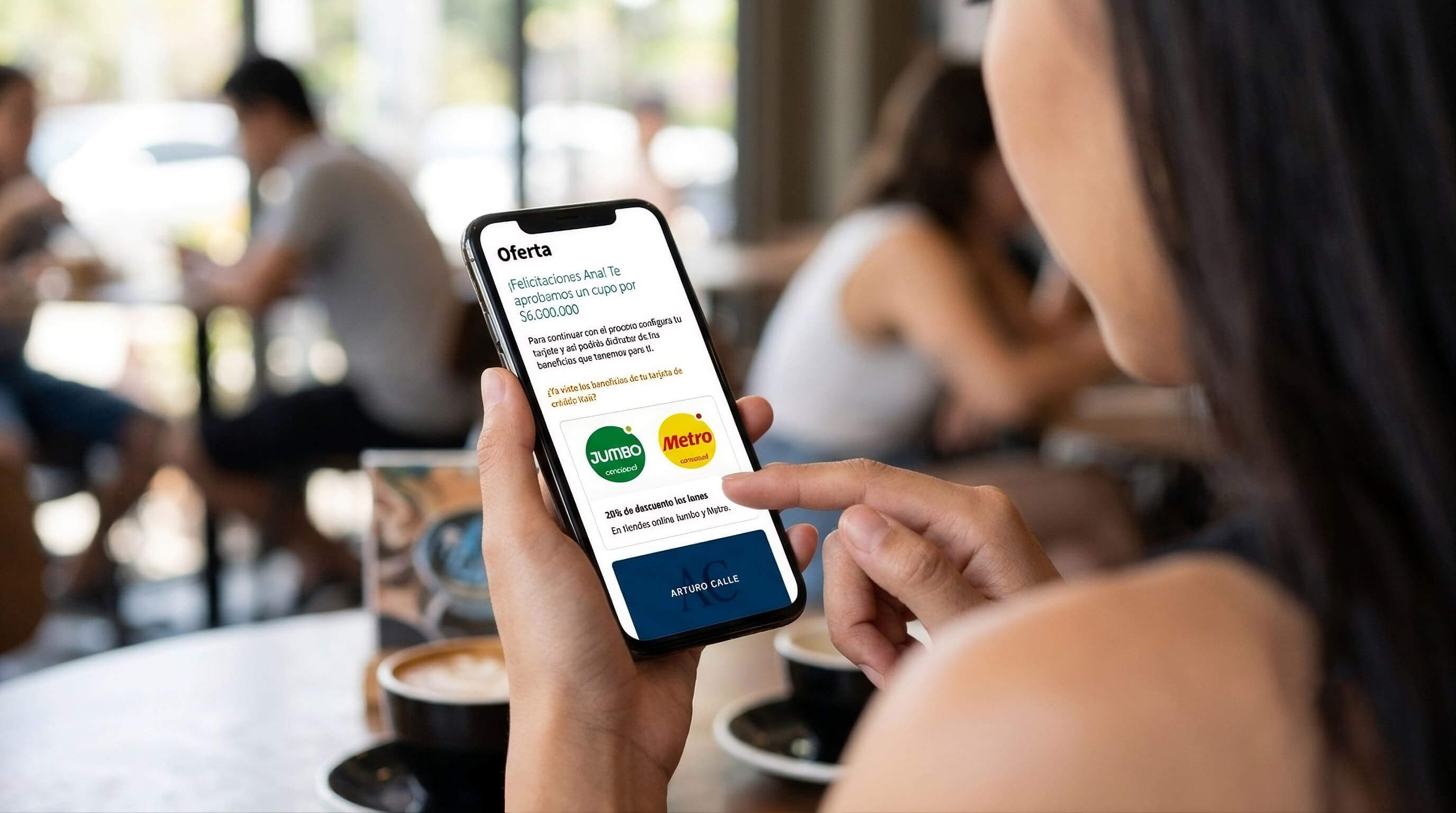
Credit Cards
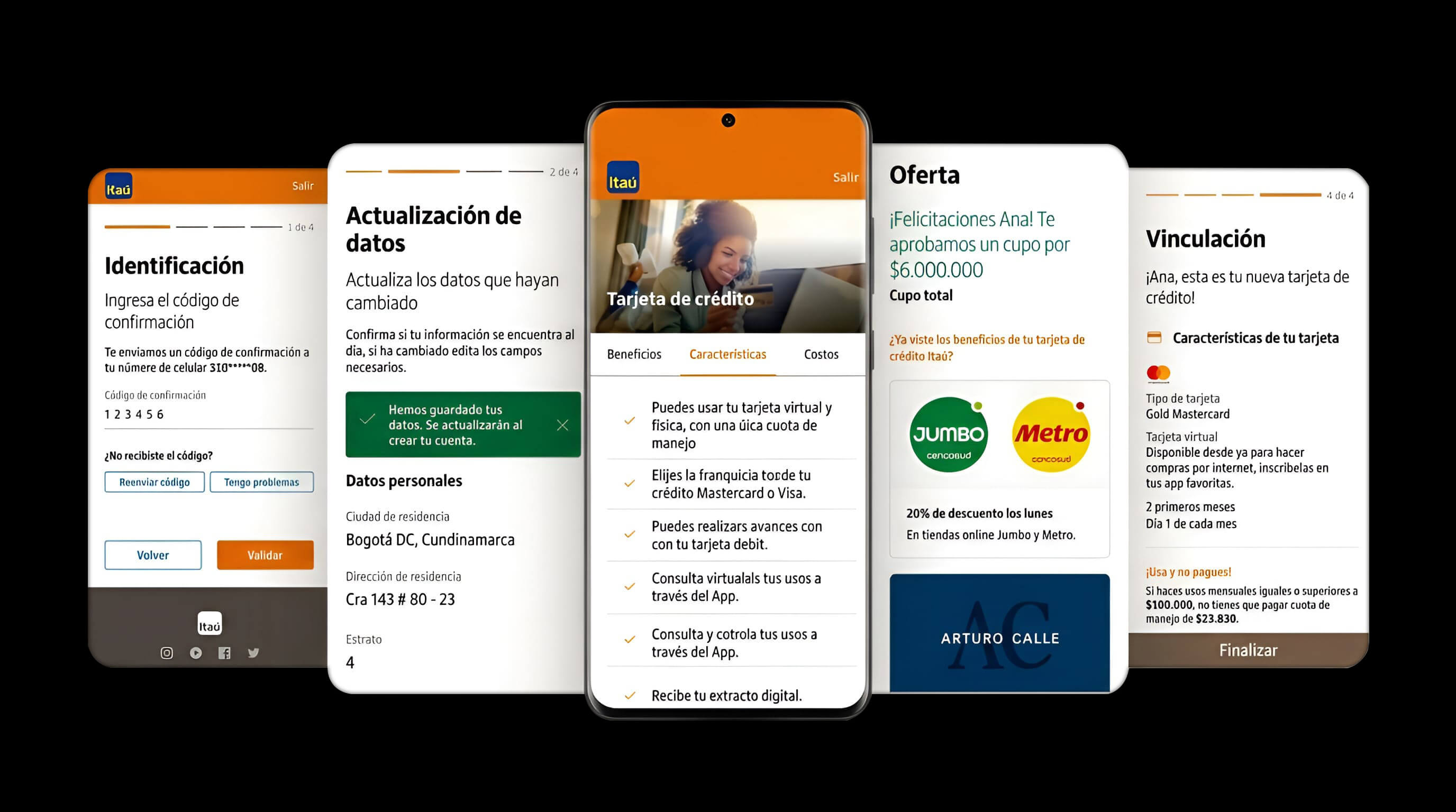
The flow shown above, for both new and existing customers acquiring a card entirely from the app.
 07
07
 08
08
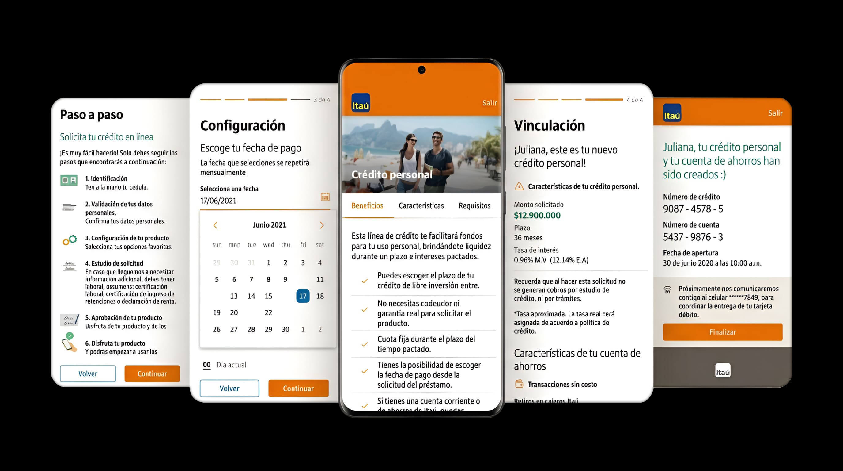
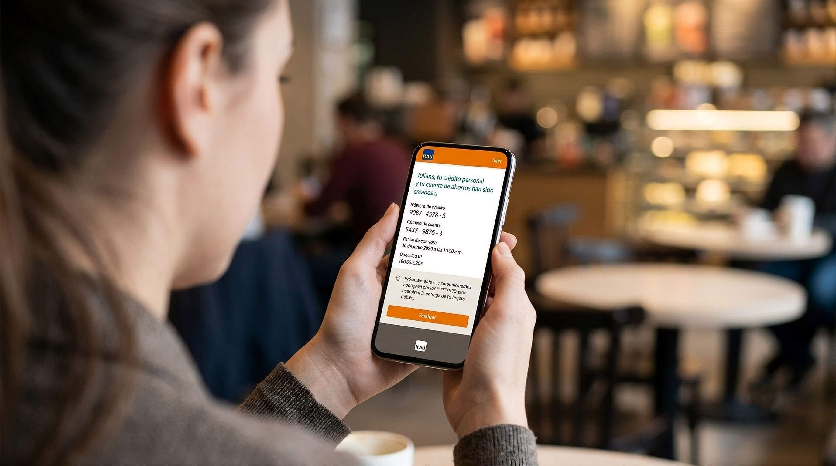
Personal Loans
A personal loan flow, built on the same five-stage structure, from the offer to disbursement terms.
 10
10
 11
11
The interesting part wasn't the happy path.
Behind those five stages was real banking logic to design for. A few of the branches that shaped the flow:
01 Not every customer answers the same questions
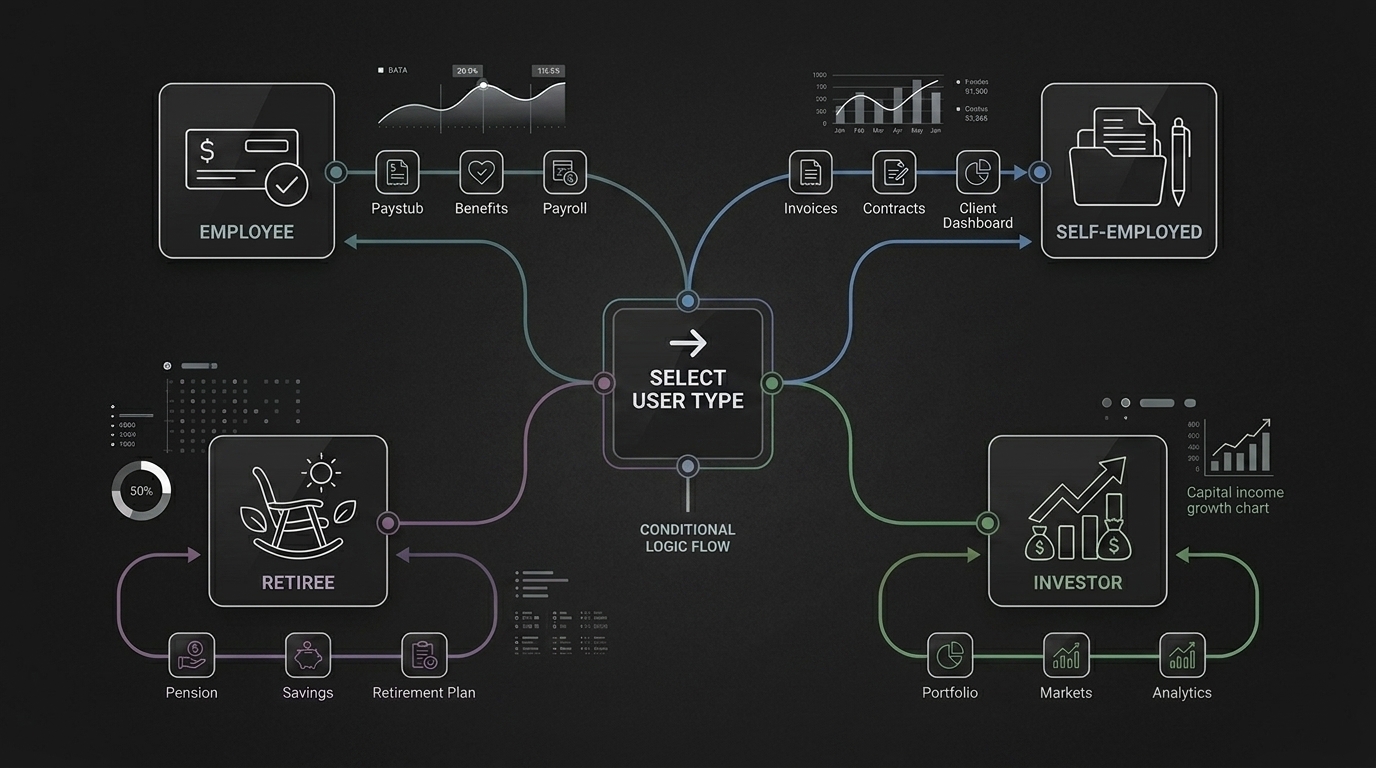
The logic. Required data, and how income gets validated, changes depending on whether someone is an employee, self-employed, retired, or living off capital income.
The design problem. The flow had to branch cleanly into each path instead of asking everyone the same generic questions.
02 Approved, rejected, or something in between
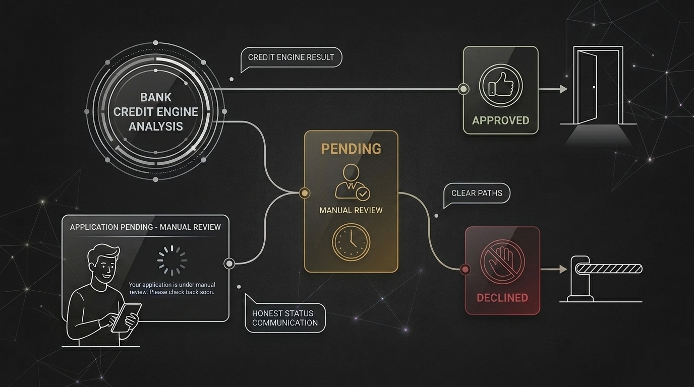
The logic. Beyond a simple approve or reject, the bank's credit engine could also return a "gray zone" result that needed manual review.
The design problem. The flow needed an honest way to tell a customer their application was pending, not stuck or declined.
03 Promotions that don't apply to everyone
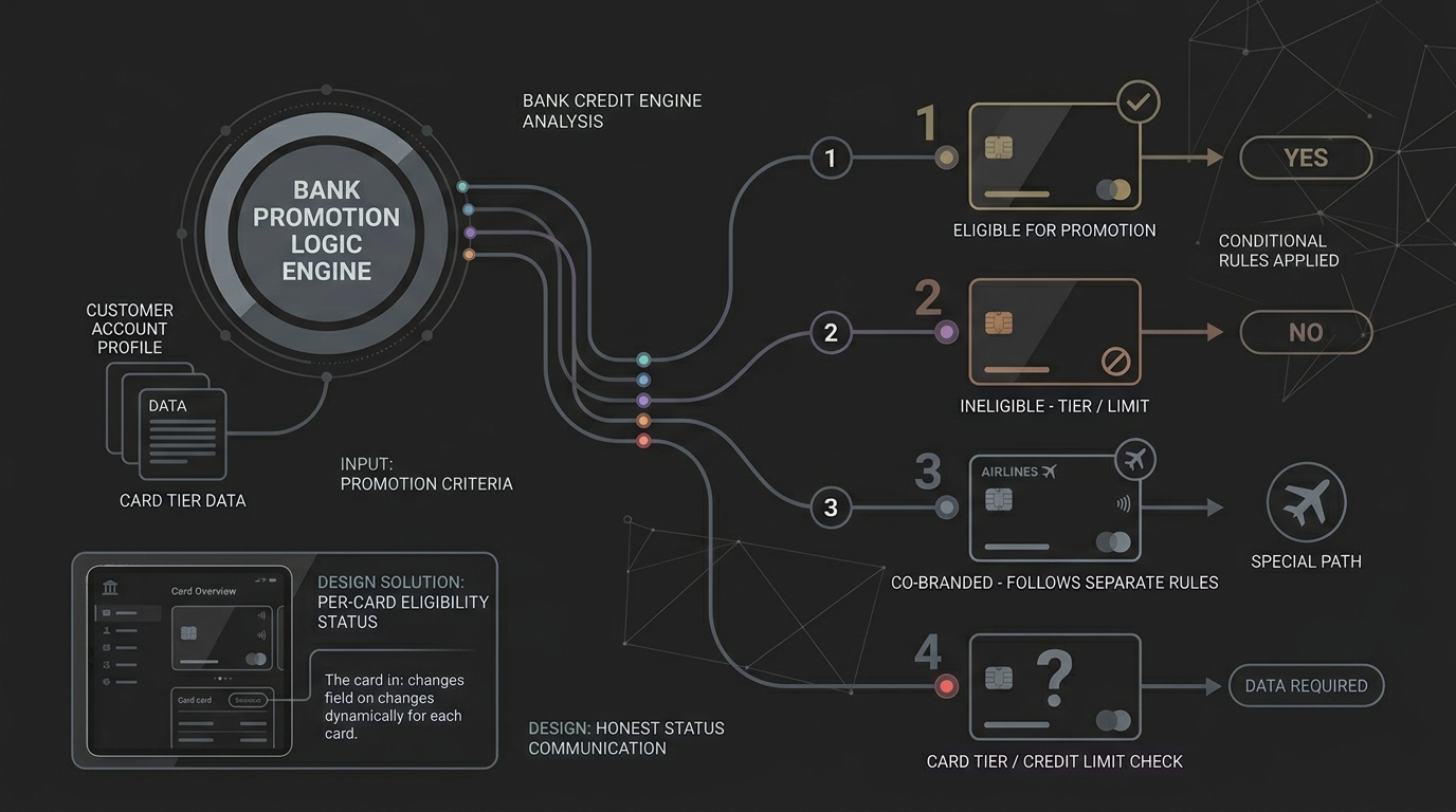
The logic. The bank's deferred-payment promotion only applied to certain card tiers and credit limits, and co-branded rewards cards followed their own separate rules.
The design problem. Eligibility had to be checked and communicated per card, not assumed to apply across the board.
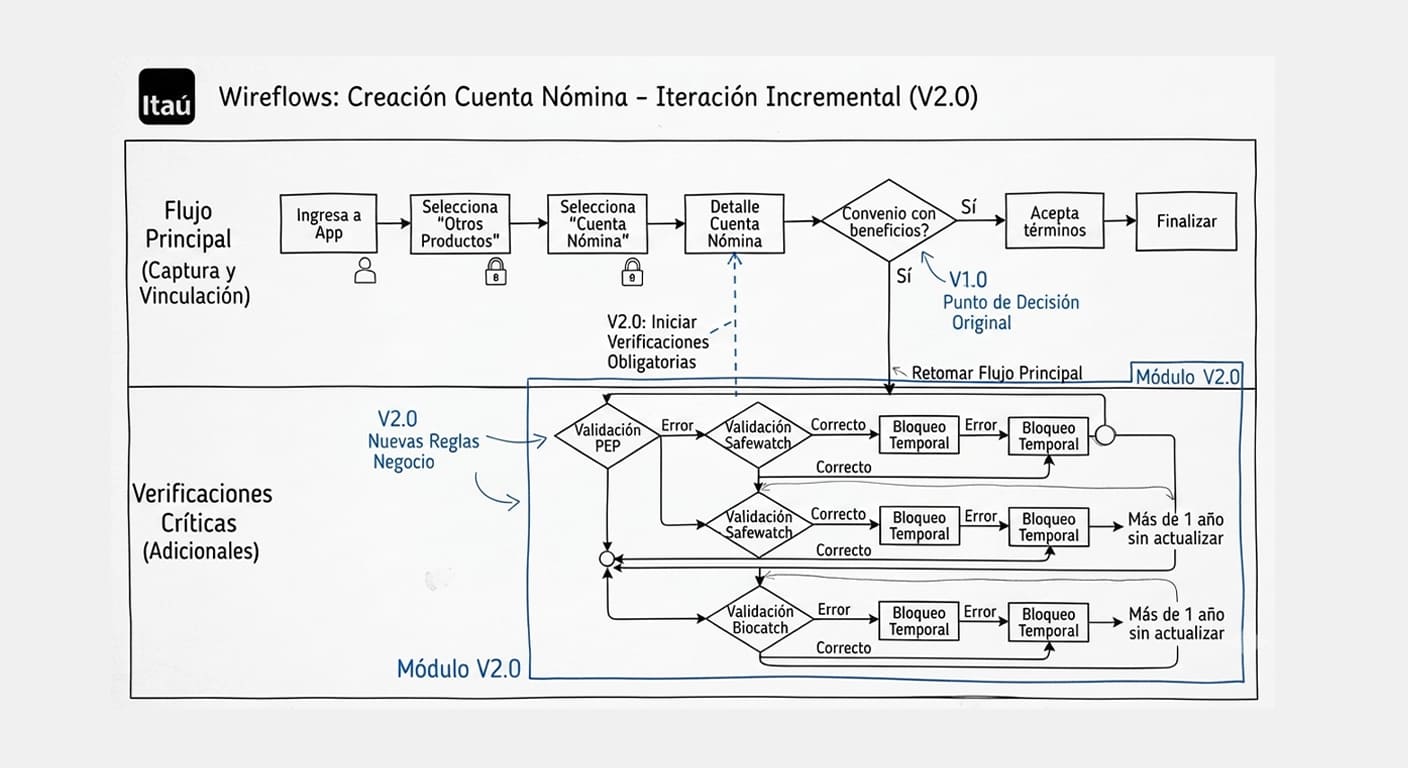
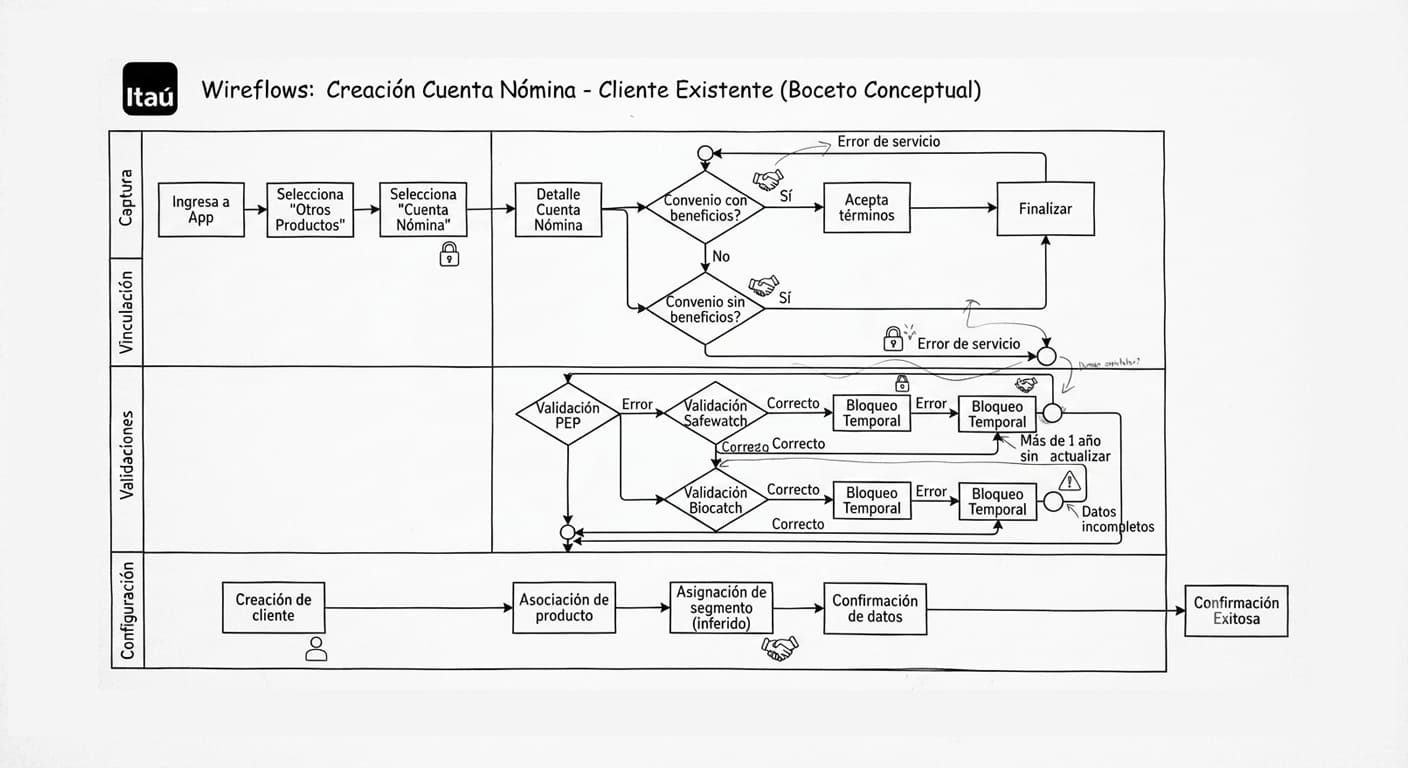
Wireflows were the shared language.
A project like this only works if UX, product, marketing and development read the same map. The wireflows were that map: every step, branch and piece of copy laid out clearly enough that a marketing lead, a developer and a compliance reviewer could look at the same diagram and agree on what it meant.
From there, prototypes turned those flows into something people could click through, and development built them inside the bank's existing systems, improving both incrementally rather than rebuilding everything at once.
 12
12
 13
13
These are general, product-level figures shared by Itaú Colombia's own product team, averaged across the three products with comparable data. More detailed or product-specific results stay confidential to the bank.
Learnings
- Legacy systems shape what's possible: every flow had to work within technology the bank already had.
- A wireflow only works if everyone reads it the same way: clarity mattered more than polish at that stage.
- Compliance is part of the product: identity checks are as much the experience as anything else.
Recommended next steps at handoff
- Incremental modernization: continuing to update the technology behind these flows, product by product.
- A stronger design system: evolving the shared components these flows were built from.
- Full digital coverage: extending the same approach to any products that still require a branch visit.
Most of what made this project real doesn't show up in a single screenshot: the cross-team alignment, the edge cases, the constraints of a tech stack built from three merged banks. What I can show is the structure that came out of it, flows clear enough that four different teams could build from the same map.
Itaú Colombia · AccentureMore work
Three more projects worth a look.
 01
01
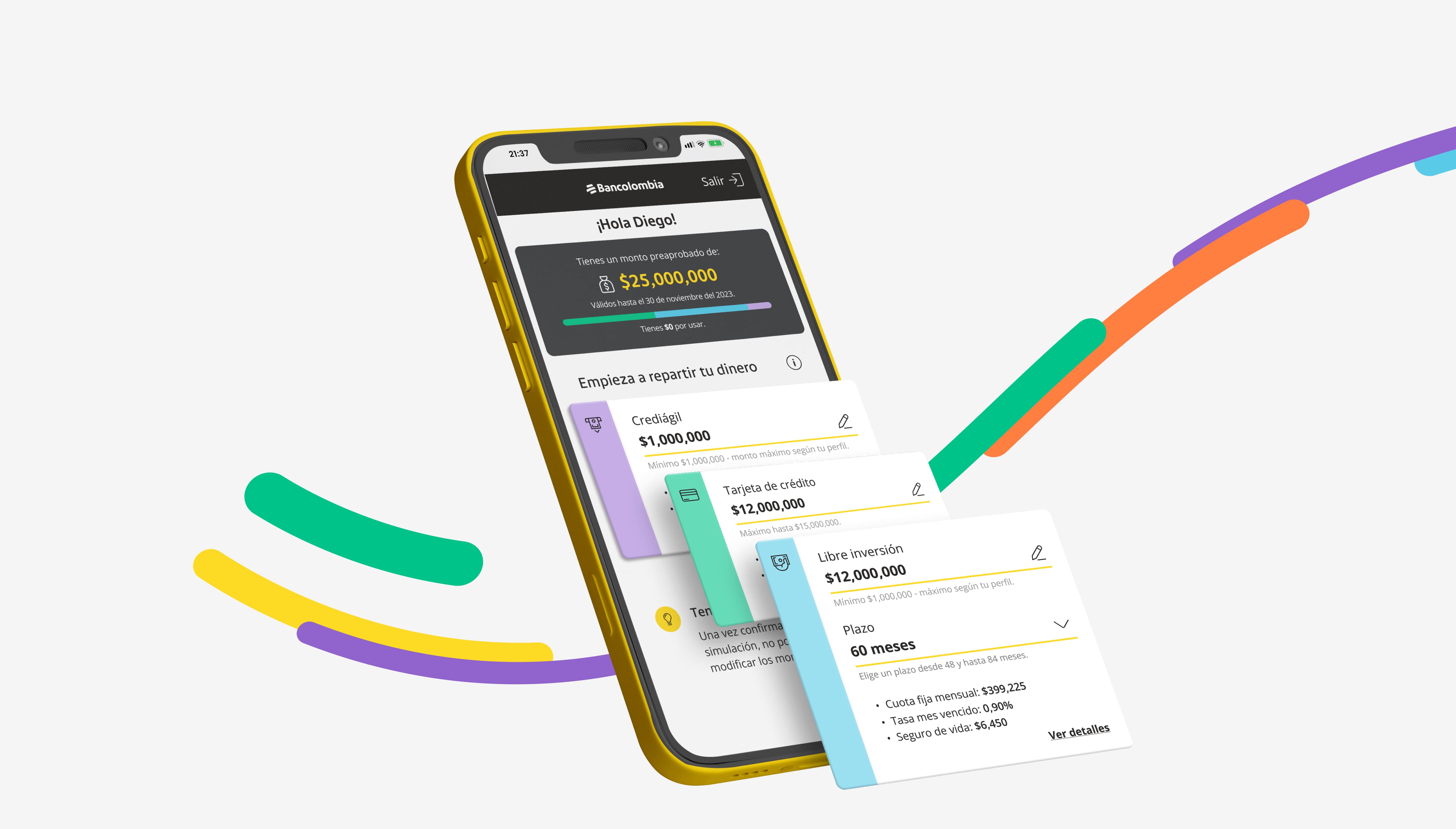
Pre-approved Loans
Simplifying pre-approved loan activation for Bancolombia's app and website.
 03
03
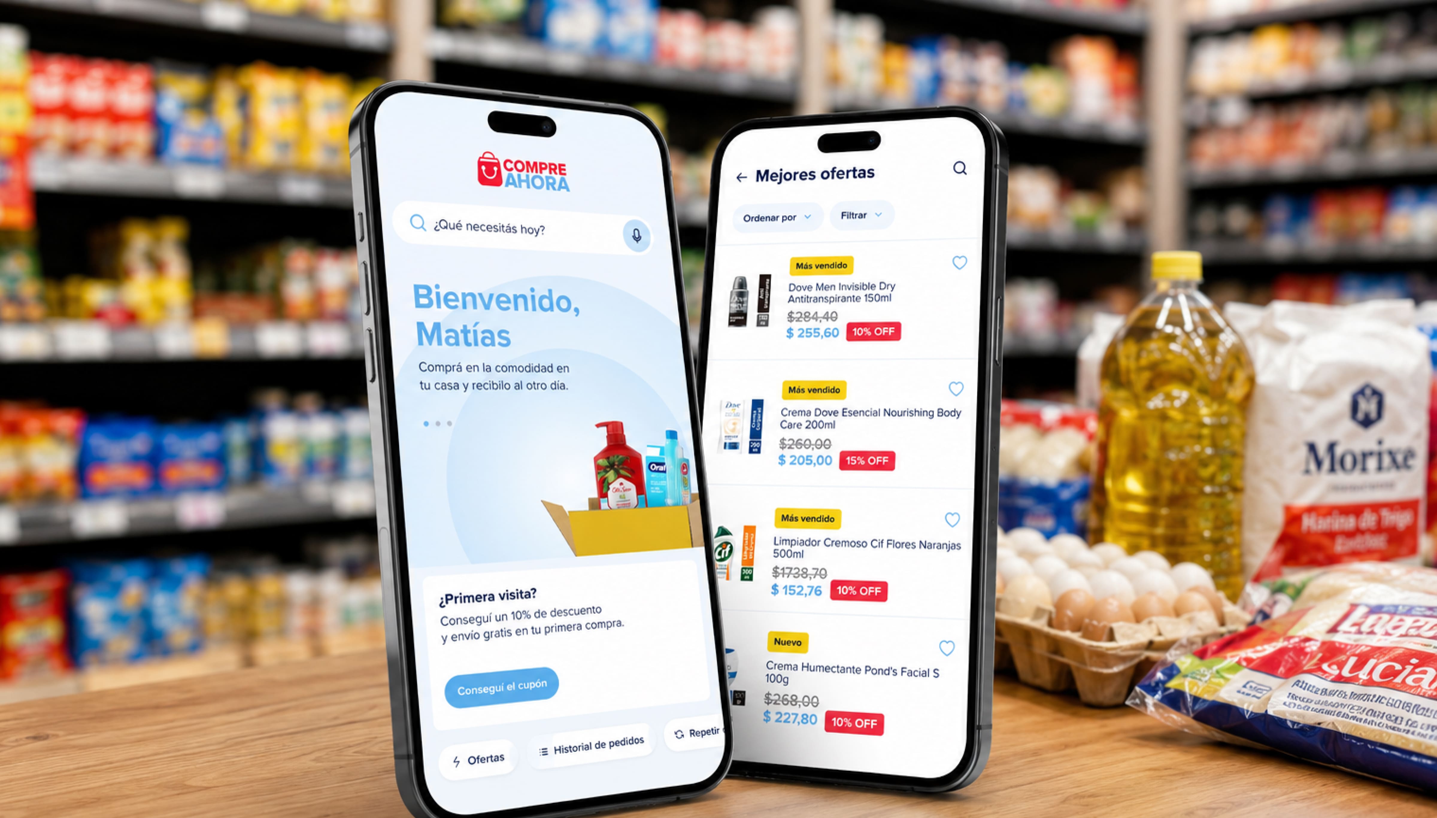
Compre Ahora
Helping small retailers across Argentina restock their stores from their phones.
 02
02
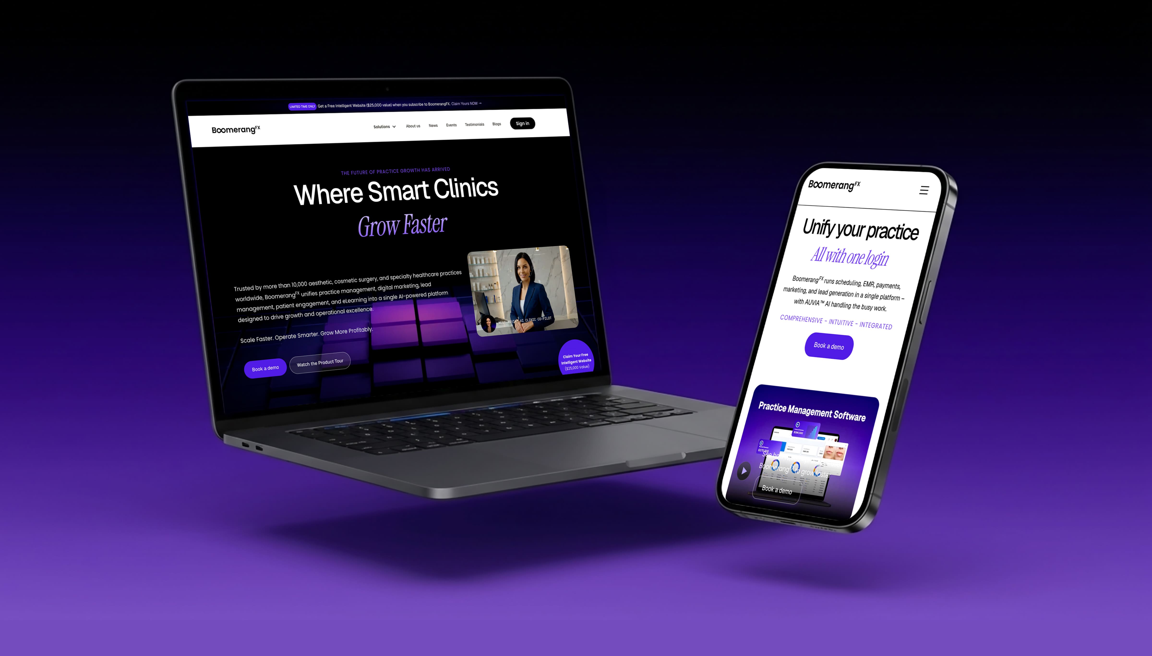
BoomerangFX
Refining the visual system and building a fully responsive site in Webflow.