Full grid
Full grid layouts, multi-column stat blocks, side-by-side product comparisons.
Rebuilding the marketing site for an AI-powered practice growth platform used by 10,000+ clinics worldwide.
 01
01
An AI-powered practice growth platform for med spas and cosmetic clinics, ranked among Canada's fastest-growing technology companies.
A single login for an entire aesthetic practice.
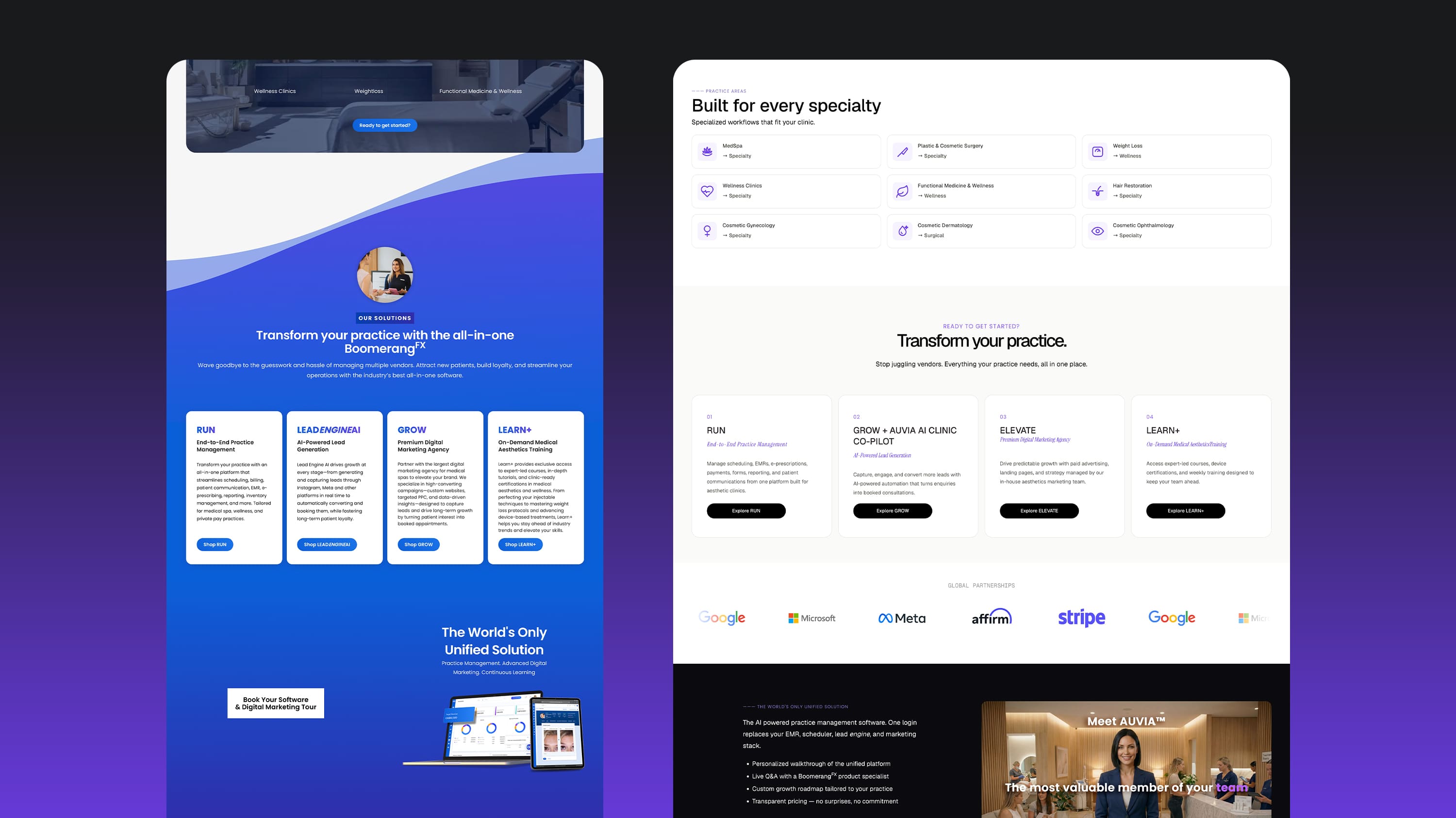
BoomerangFX is an AI-powered clinic software and marketing platform for private-pay healthcare: med spas, cosmetic surgery, dermatology and other cash-pay practices. It brings four products, RUN, GROW, ELEVATE and LEARN+, under one platform, used by more than 10,000 practices in 20+ countries.
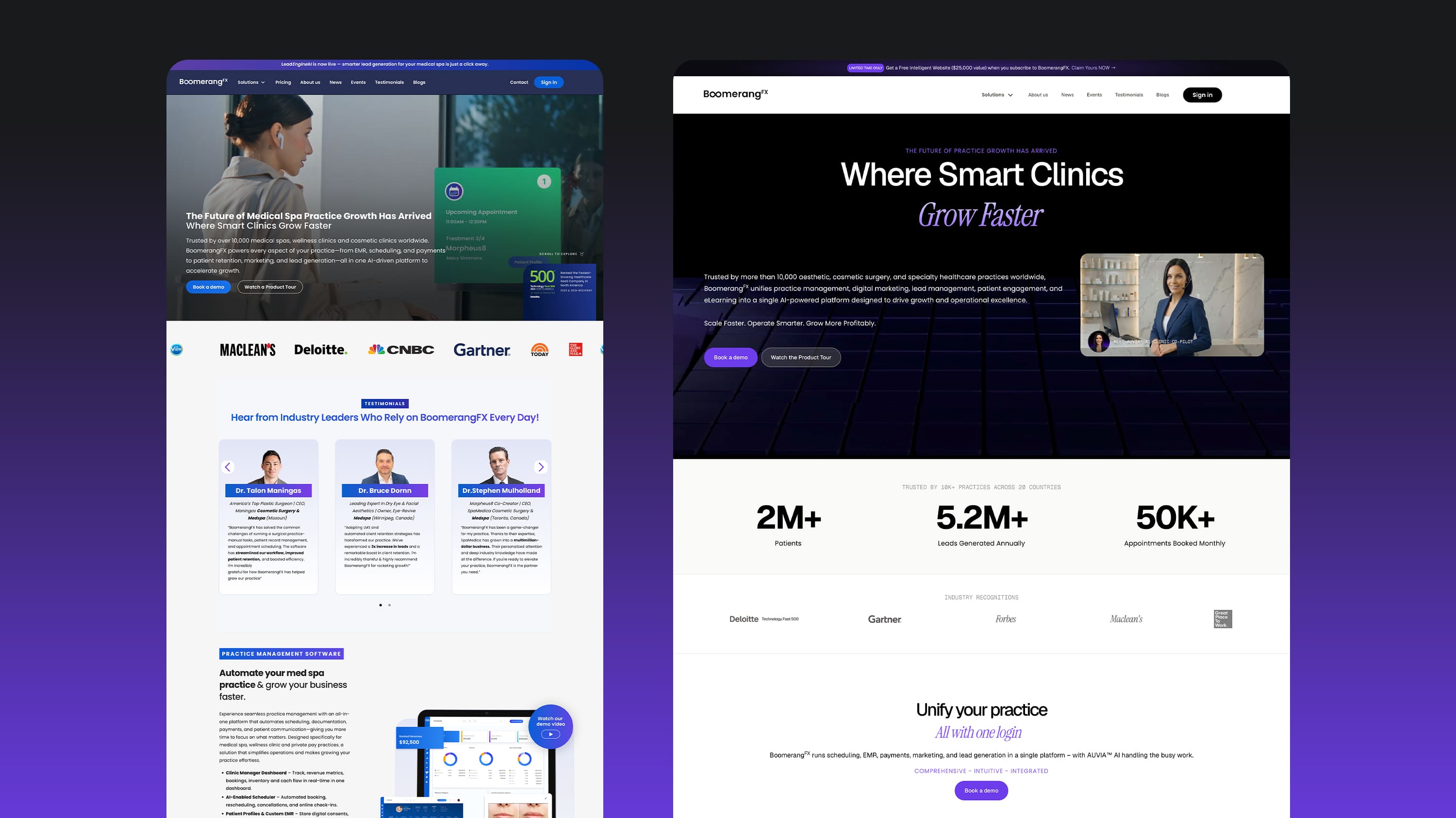
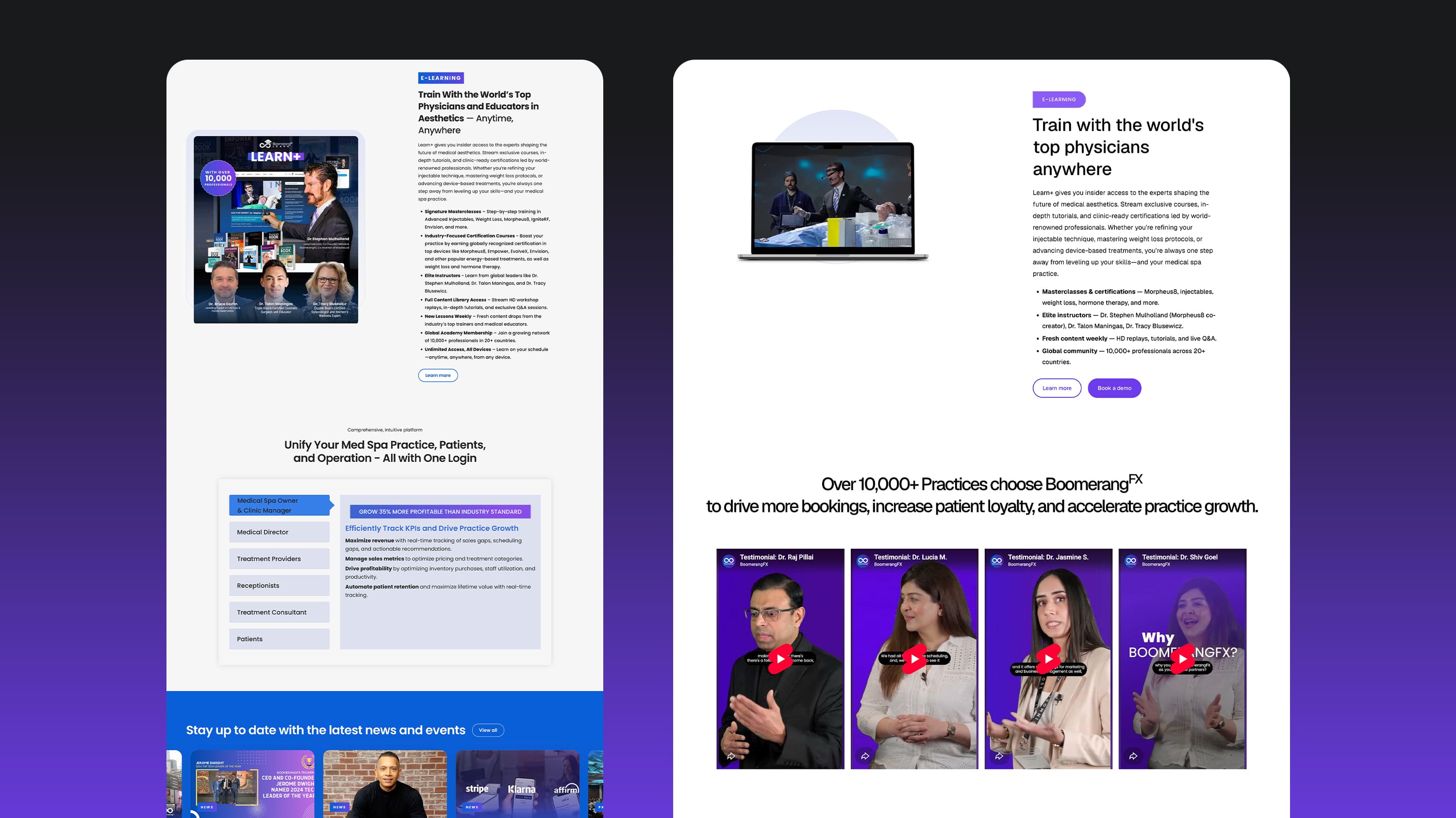
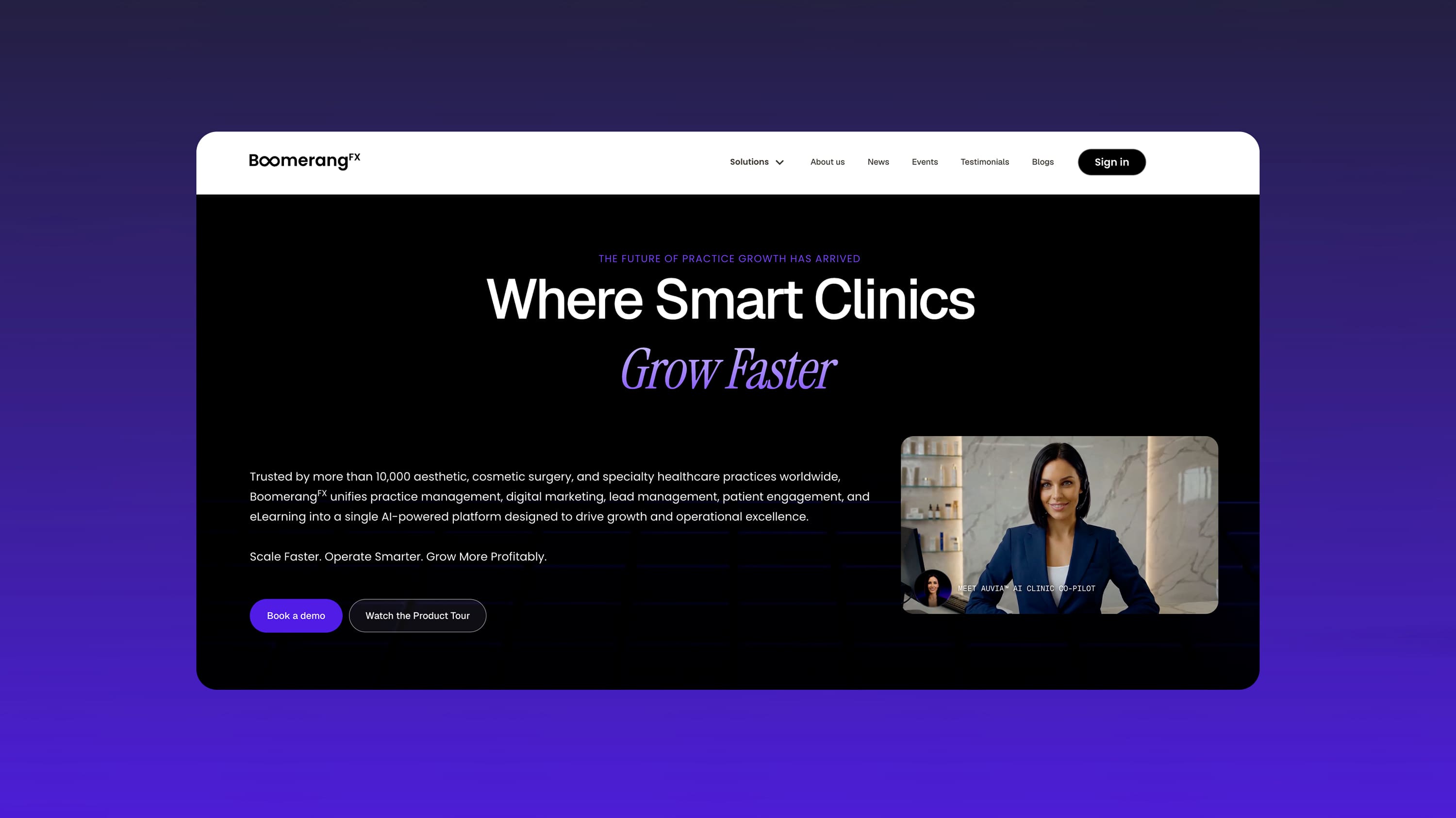
The site already existed, but the visual style was dated and didn't match where the company is now, including AUVIA™, its new AI clinic co-pilot, which had no real presence yet. The brief: take the internal team's wireframes, raise the visual system to an enterprise SaaS level, and ship a fully responsive production site in Webflow.
Started from the internal team's wireframes and an in-progress Figma file.
Ran co-creation sessions with Marketing and Leadership to refine layout, system and messaging together.
Finalized the Figma file: sharpened hierarchy and the visual system instead of starting over.
Built the production site in Webflow, refining details directly in the browser as the build progressed.
Refining the design with Marketing and Leadership.
The team already had wireframes and a rough direction. The job was to sharpen that, not override it: walking through each section with Marketing and Leadership, and testing whether one visual system could hold four different products without feeling generic.
Reviewing what the internal team had already built.
Working through layout and messaging with Marketing and Leadership.
Sharpening type, color and hierarchy across every section.
Locking the direction before it moved into Webflow.
Building the site, refining details directly in the browser.

What we did. Worked with Marketing to decide, section by section, which product leads and which supports, instead of giving all four equal weight everywhere.
Why. A page that treats four products as equally important treats none of them as important. Visitors need a clear entry point before they can take in the rest.

What we did. Refined the type scale, color use and imagery so the site reads as a serious enterprise SaaS product, not a generic medical template.
Why. The buyer is a practice owner or executive comparing BoomerangFX to other growth platforms. The site has to look like the category leader it's positioned as.
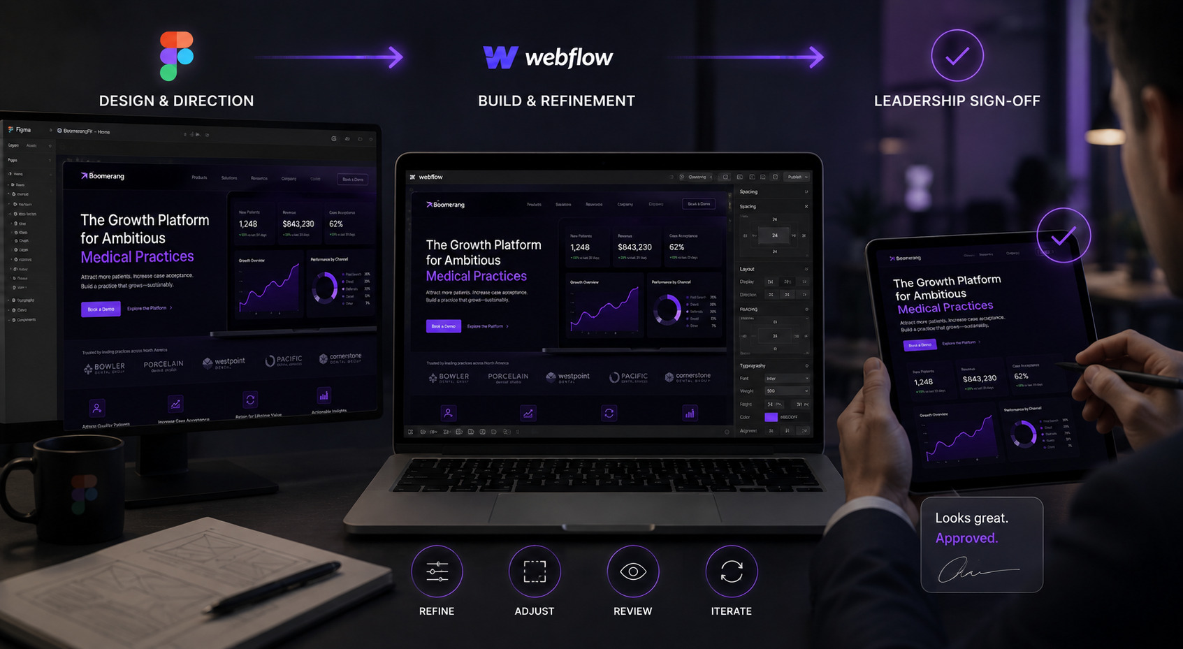
What we did. Leadership reviewed and signed off on direction in Figma, but a fair number of refinements (spacing, copy, small layout calls) happened directly in Webflow once the build was live.
Why. Some decisions are easier to make in a real, responsive browser than a static frame. Treating Webflow as part of the design process kept the site closer to what leadership wanted.
 03
03
 04
04
 05
05
Built inside Webflow, structured to stay easy to maintain.
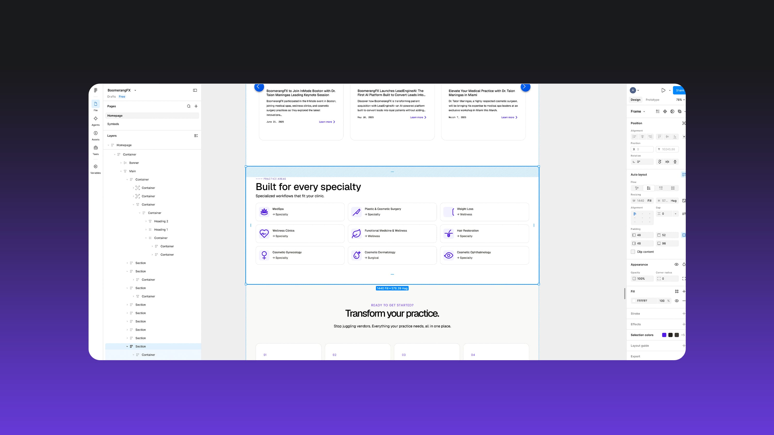
The build follows Finsweet's Client-First naming system, so anyone on the marketing team can duplicate a section, swap copy and images, and trust it won't break the rest of the page. BoomerangFX's brand system is still evolving, so the site was built on a consistent internal system, ready to absorb a more finished brand later instead of needing a rebuild.
Colors, spacing and type sizes were set up once, at the system level, before a single section was built. A brand update later means changing it in one place, not hunting through dozens of pages.
Every element is named the same predictable way across the site. Open any section and you can tell what it does without guessing.
Brand colors, spacing and type sizes are controlled from a handful of central styles instead of being set inside every section.
Repeating patterns (cards, CTAs, stat blocks) are built once as components, so updating one instance updates every instance sitewide.
 06
06
 07
07
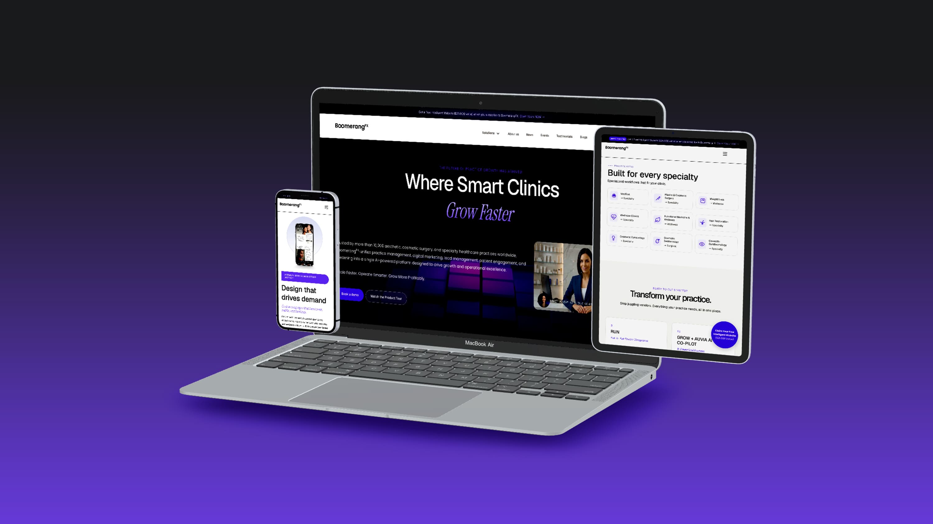
Four breakpoints, one connected system.
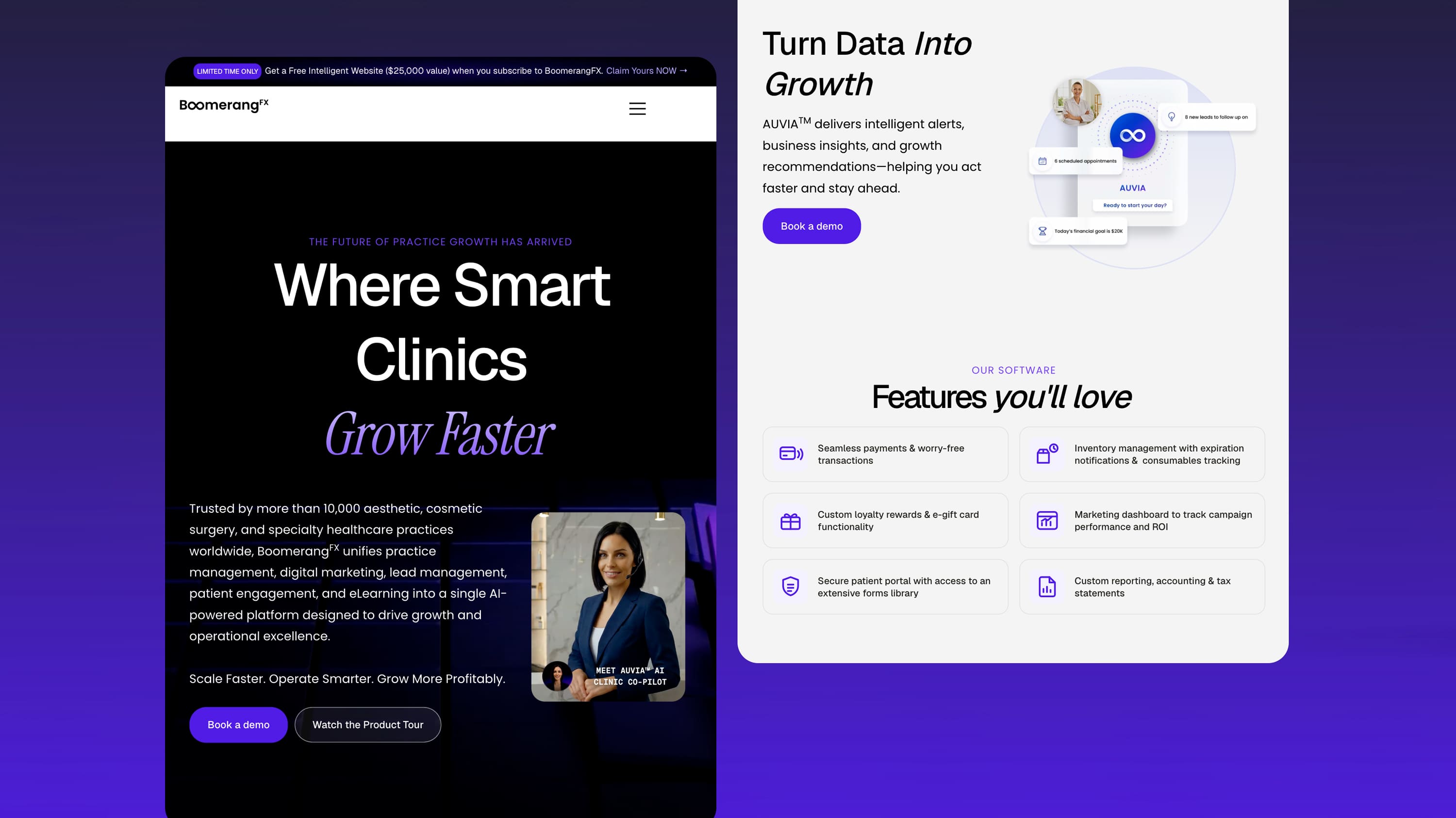
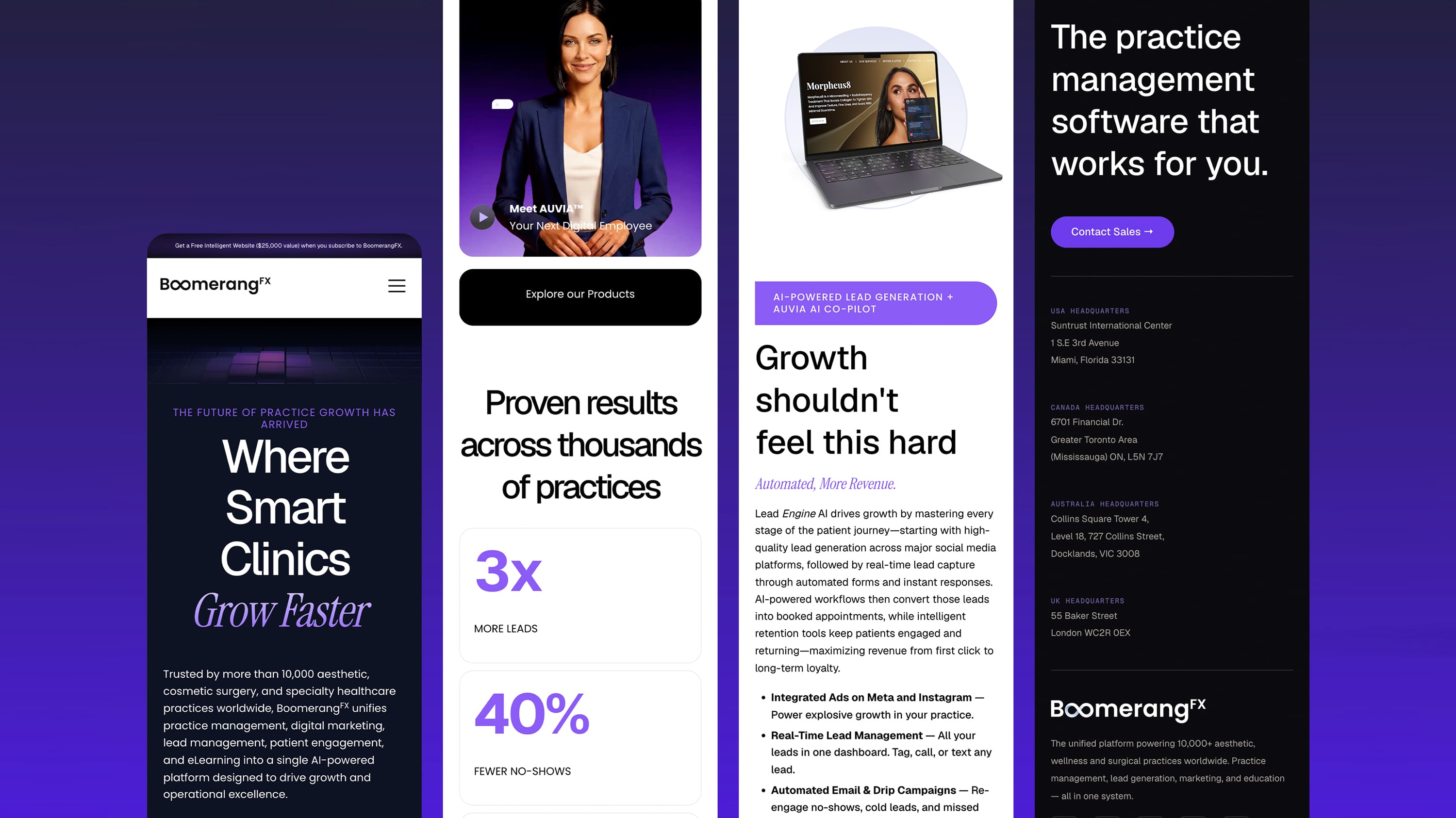
Text and spacing adjust smoothly as the screen narrows, instead of jumping at fixed widths. Desktop, laptop, tablet and mobile each got their own design pass, since many of BoomerangFX's visitors browse from their phones.
Full grid layouts, multi-column stat blocks, side-by-side product comparisons.
Grids go from 4-5 columns down to 3, with whitespace preserved.
Navigation collapses, multi-column sections drop to two columns or stack.
Single-column flow, tap targets resized, sticky CTA repositioned for thumb reach.
 08
08
 09
09
 10
10
 11
11
Built to feel fast for real visitors.
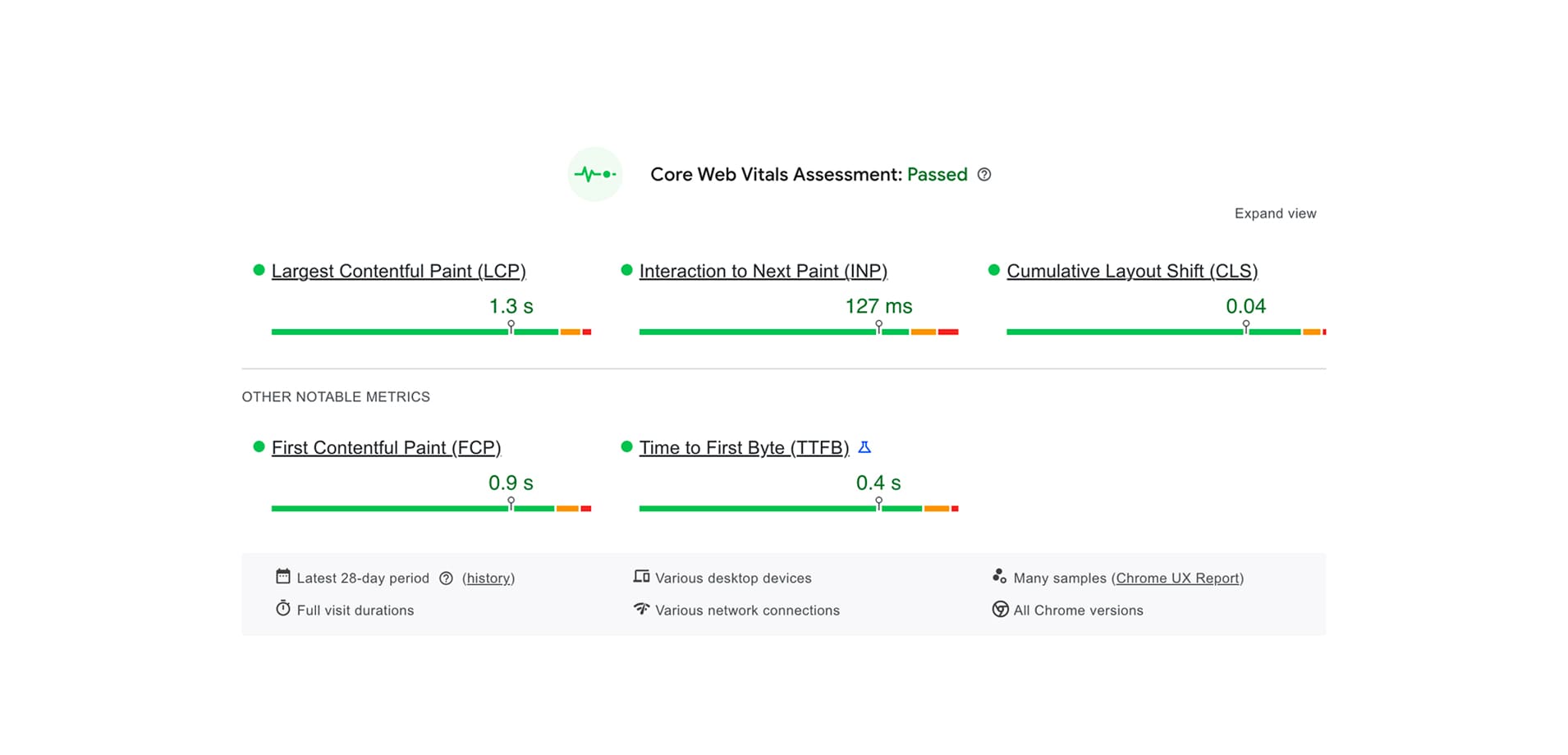
A hero video, product demos and animated counters can get heavy fast, so every interaction was weighed against its load cost. Real visitors, measured by Google over a 28-day window, get Core Web Vitals passing on both desktop and mobile.
Core Web Vitals passed on both desktop and mobile, based on field data from real visitors.
Scroll reveals and hover states use short, simple transitions, reviewed for necessity rather than added by default.
Stat counters animate once on scroll into view and never re-trigger, so they don't distract on re-scroll.
 12
12
BoomerangFX already had the ingredients: wireframes, a product story worth telling, a marketing team who knew the audience. The work was tightening the visual system enough to carry an enterprise SaaS story across four products, then building it in Webflow in a way the team can keep growing on their own.
BoomerangFX · Webflow buildThis case study describes the process in general terms. Internal Figma files, Webflow exports, brand assets and anything under BoomerangFX's NDA aren't shown here, only what's publicly visible on the live site.
Three more projects worth a look.
 01
01
Simplifying pre-approved loan activation for Bancolombia's app and website.
 03
03
Helping small retailers across Argentina restock their stores from their phones.
 04
04
Turning Itaú Colombia's branch-only products into flows customers finish on their phone.